I’ve been drinking coffee for as long as I can remember. My family tree is basically a coffee bean plant. I ain’t no coffee snob, though. I’m the kind of person who gets swayed by fancy packages and quick fixes, rather than the actual taste of the brew. I’ll admit to being a basic bitch.
So this year I decided I’d research some teas and find brands that really speak to me. As Ms. Frizzle taught me and a generation of 90s kids: Take chances! Make mistakes!
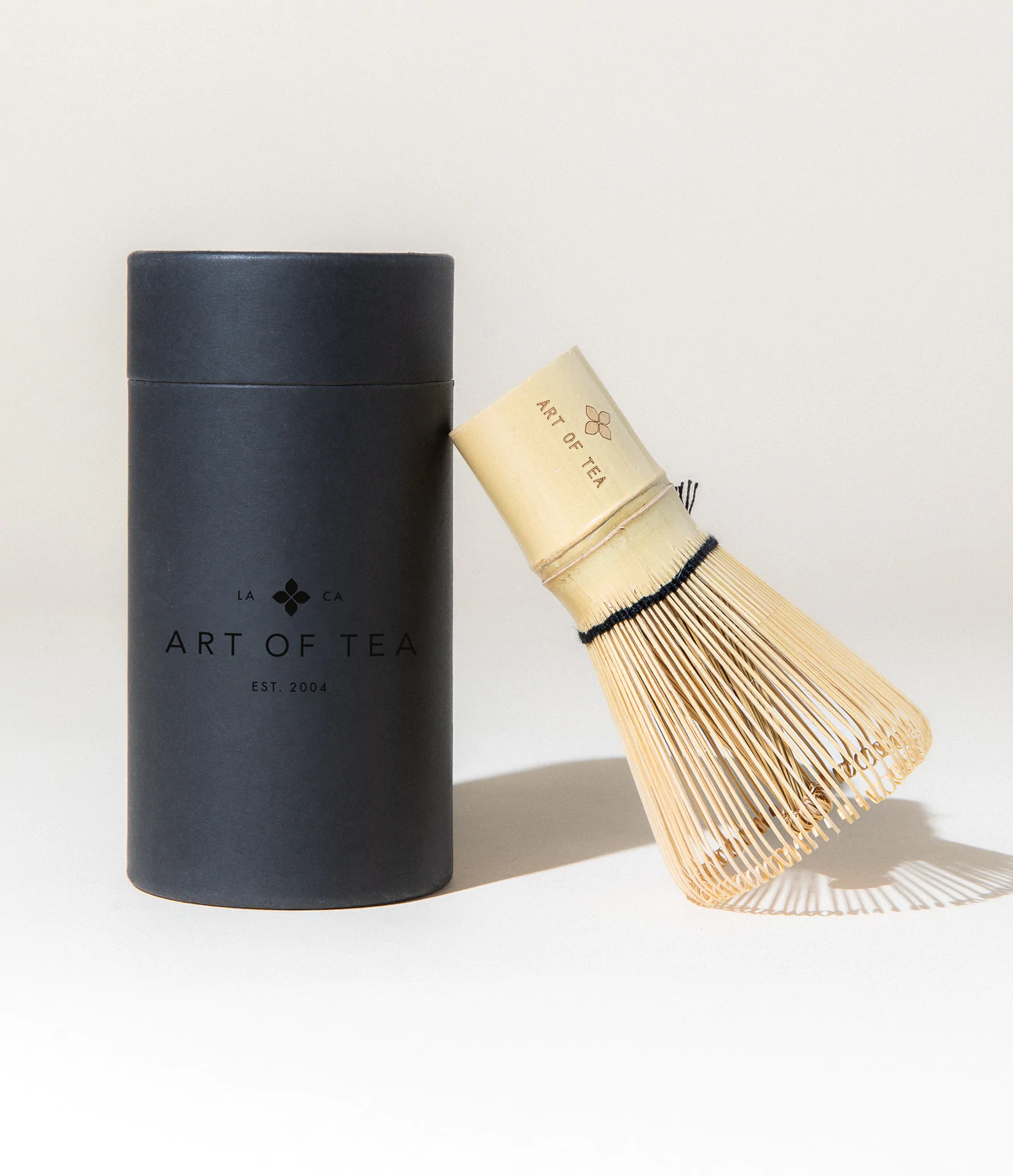
First tea of the year will be Art of Tea! I cannot wait to get my hands on the packaging! I mean the tea.
Packaging design is an important component of marketing. It can be the first thing that a customer sees, and it’s what they remember. Tea packaging design is no exception. There are many factors to consider when designing packaging for tea, such as the product type, target audience, and brand image.
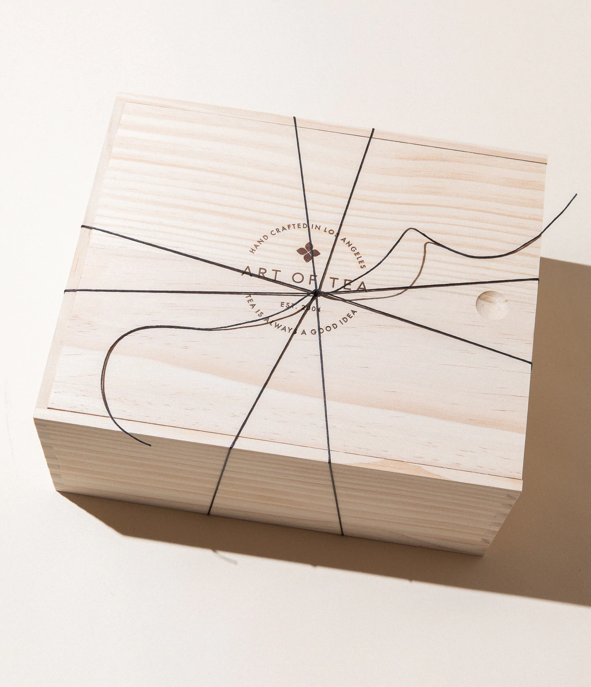
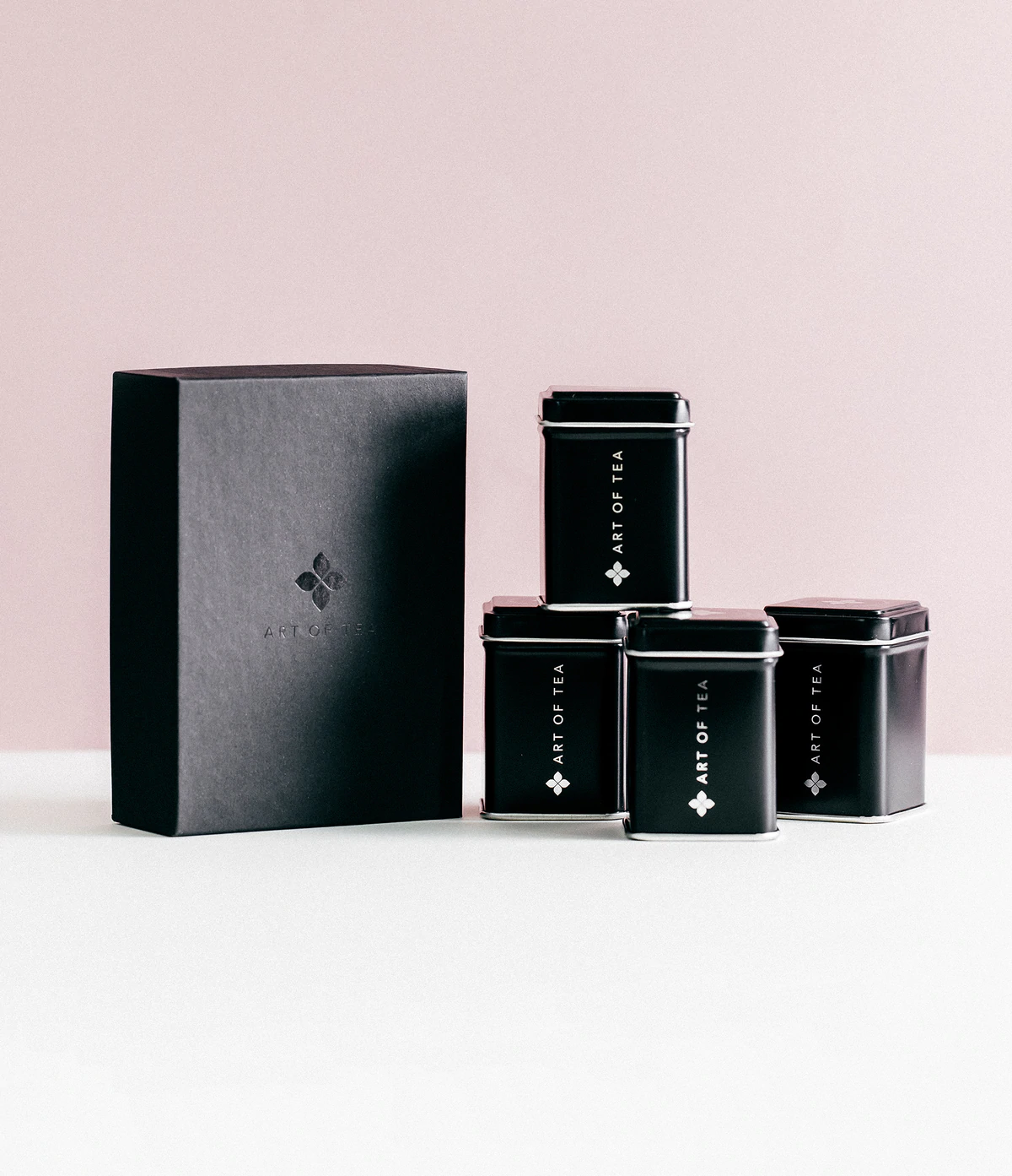
The graphic design for tea packaging should be simple yet attractive so that the product can be easily identified on store shelves. The logo should be placed prominently on the package so that customers know which company they are buying from.
What I love about Art of Tea is how they approach visual balance. With the exception of some git boxes, their exterior packaging is usually quite simple. It’s usually one color either slightly muted or fairly neutral and simple typography with a lot of white space.
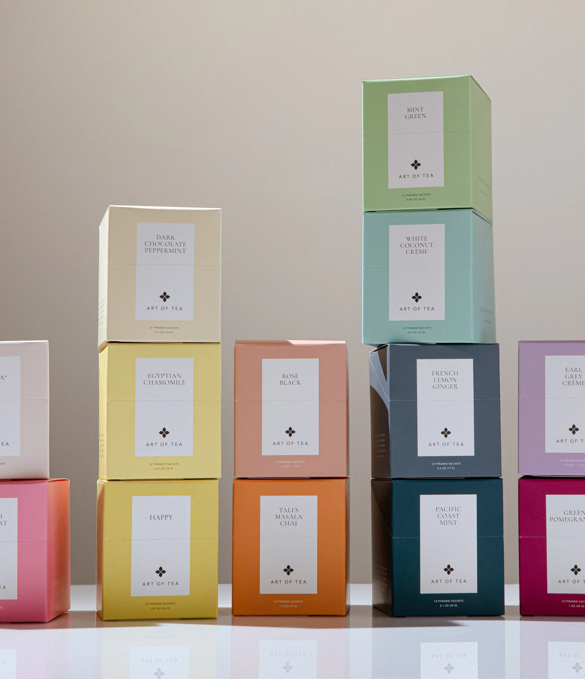
But as soon as you open the packages there are bursts of colors.
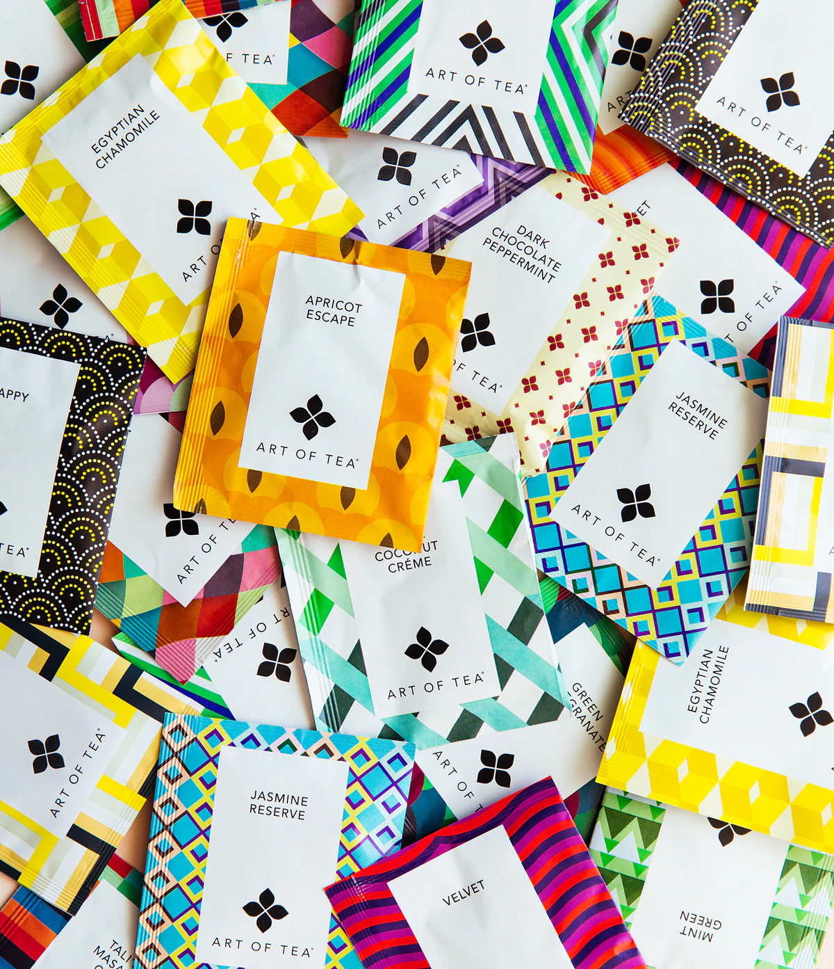
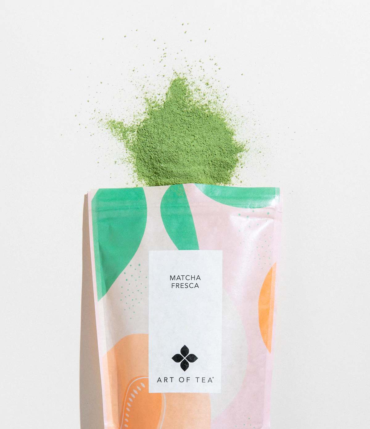
And the brand also uses the same treatment in their promotional pieces like their website and instagram. It strikes a nice balance between calm and muted with bursts of colors and flavor.
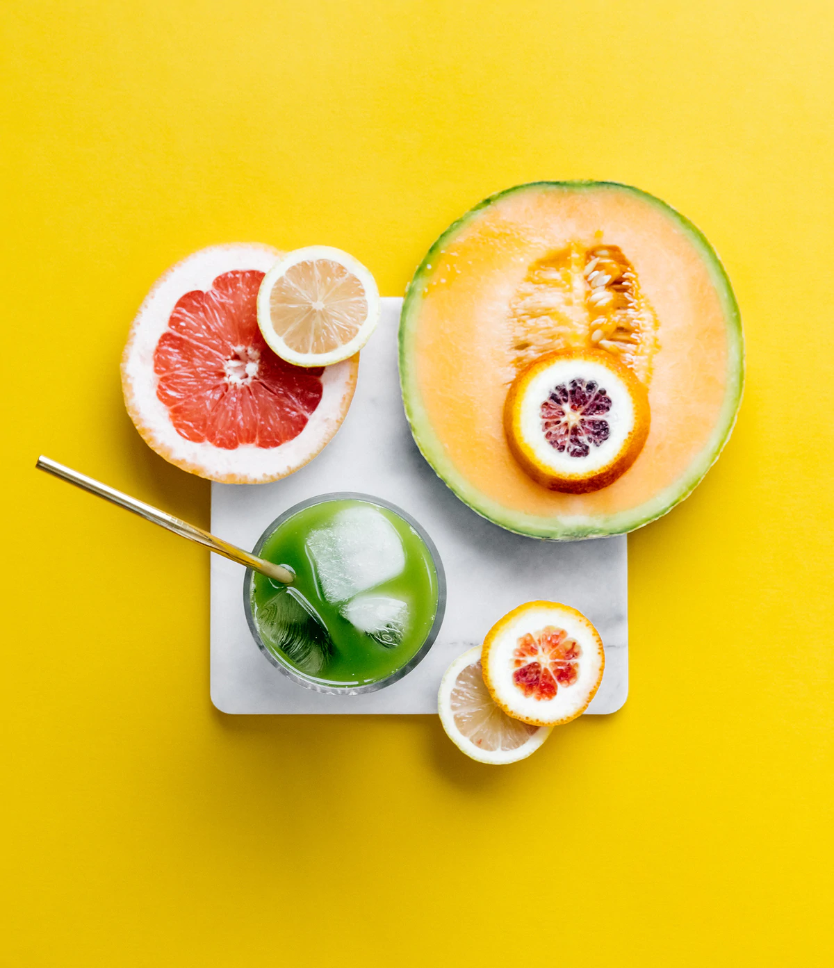
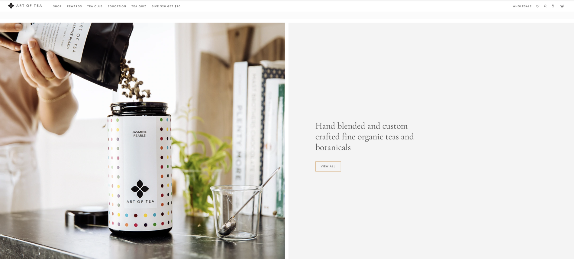
I know, I know. I’m a sucker for pretty packaging and beautifully balanced images. But I’ve also done my research! I’m excited to try these guys out. I’ve also followed them on instagram because they offer a lot of recipes.
All and all this is a great example of brand marketing done right!
