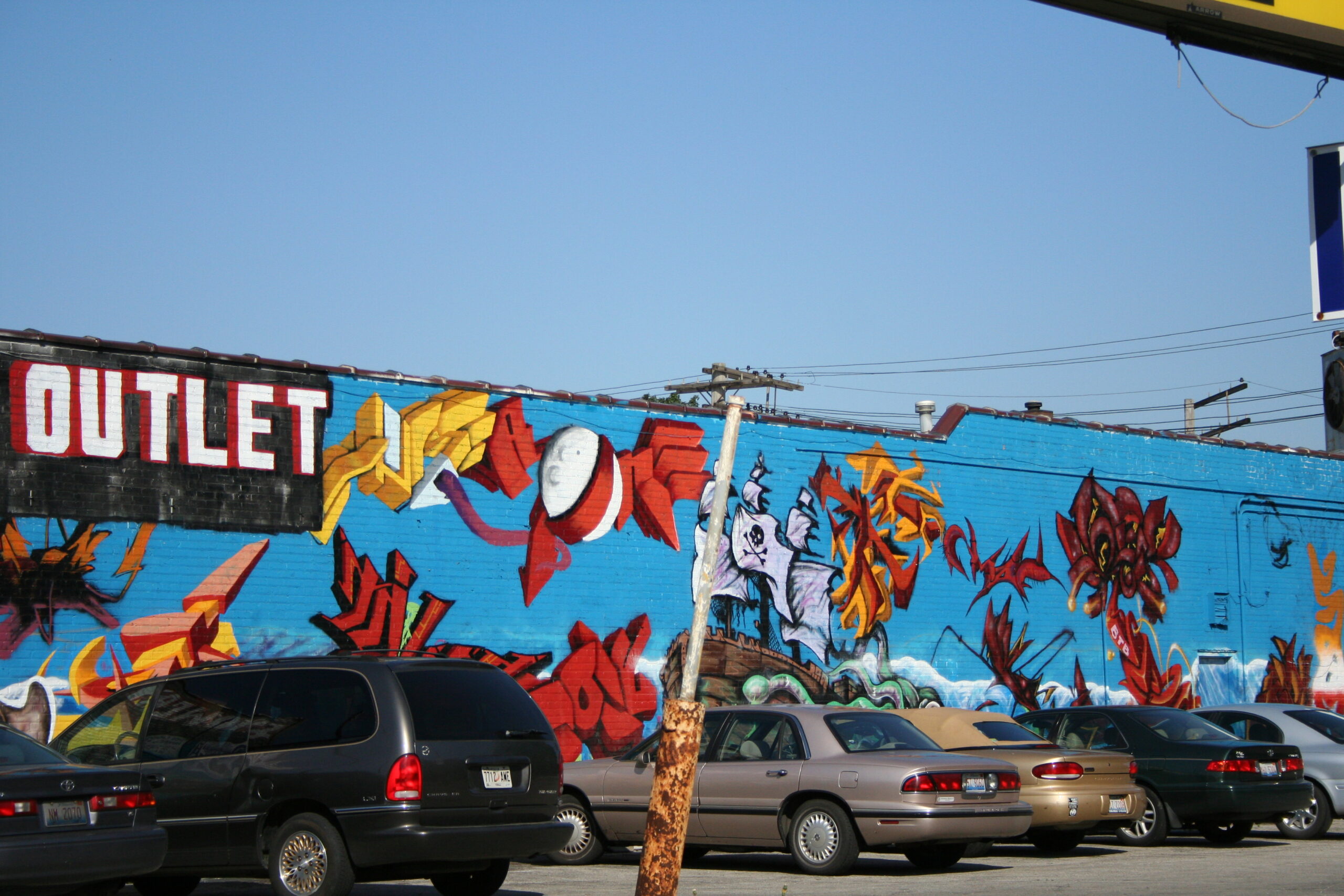
I grew up on the southside of Chicago. I was constantly surrounded by trains and buses and brick walls full of unconventional colors and street art. Ripped posters and paint splatters. These were my first introduction to art. As I grew up and learned more in school I became more obsessed. Obsessed with learning about fine art so much so that I would later graduate with a specific fine arts degree in graphic design. This meant I spent a lot of time sketching and painting and visiting gallery openings–a far cry from where I grew up. My parents both worked manual labor jobs and they fully funded my private schooling all the way to high school and then university.
My mother was incredibly nervous about ‘graphic design’–she had hoped I’d go into nursing school. I told her to trust me. She had no reason to but she did. No matter how much I’d learn, I was always forever drawn back to street art. Whenever I hit a roadblock or an absolute creative slump my go to would be to put on my headphones and walk through my alleyways. I would take notice of the dark and very intentional outlines. I understood the skill it took to create a tag on a wall…and even though street art wasn’t part of the curriculum it was part of my design upbringing. So what can designers learn? Here are just a few things that I’ve taken away.
Texture, texture, texture!
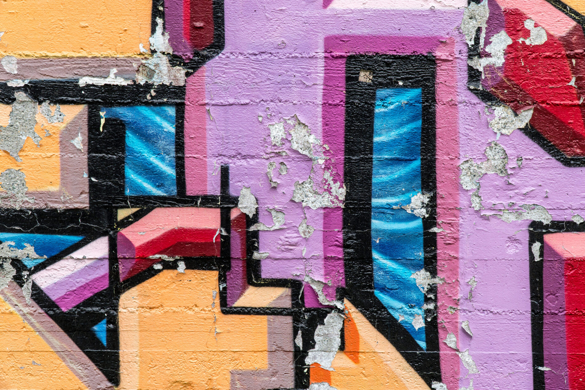
If you ever want to bring a little more depth to your design, whether it’s a background or a layout–texture even the slightest bit can add dimension. Think about how this translates to the web. Even the slightest parallaxing (a displacement or difference in the apparent position of an object viewed along two different lines of sight) on the web can create a transcendence experience.

Unexpected color combos
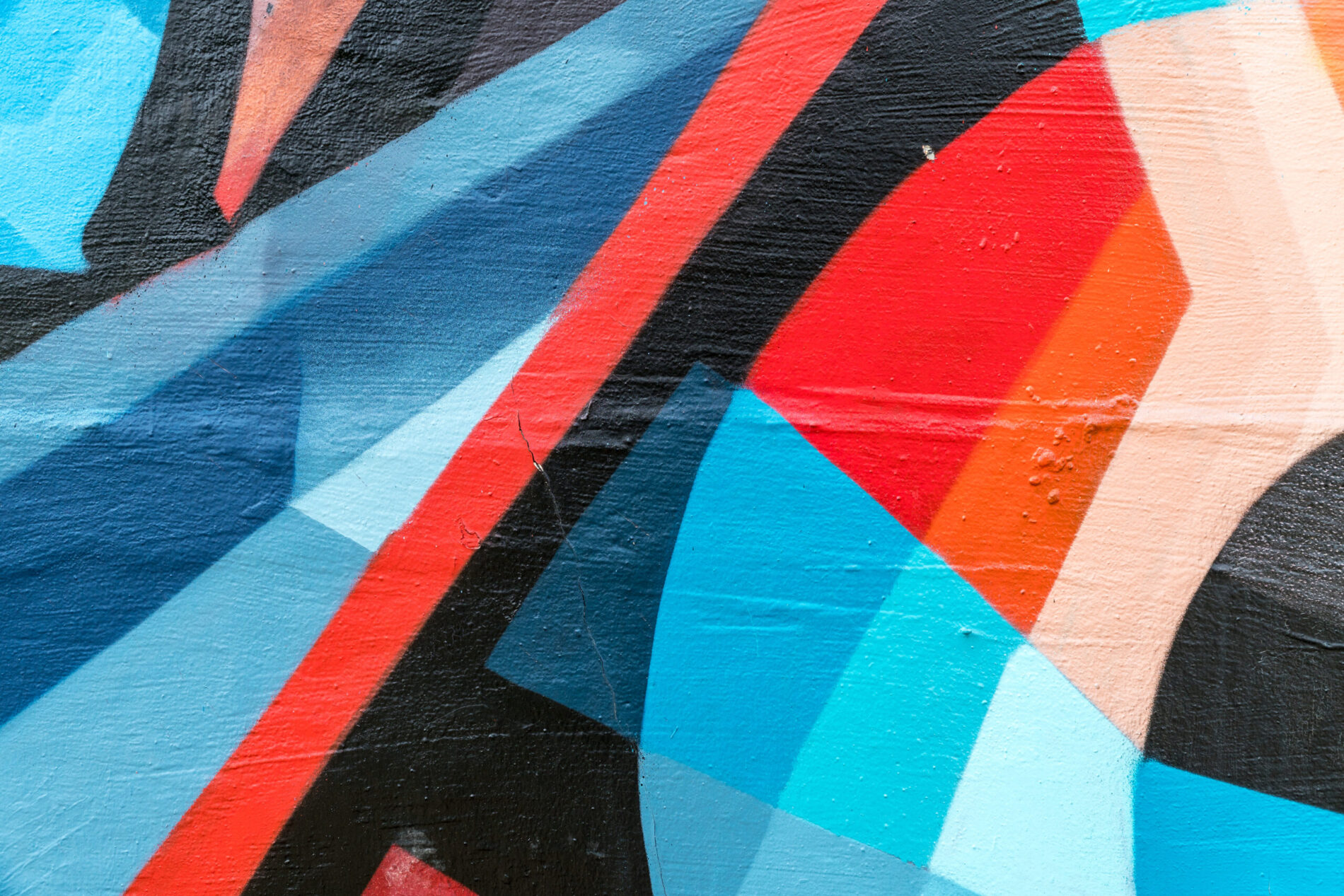
I don’t know about other designers, but sometimes when I’m working out my internal color pallet for an upcoming project I can be guilty of starting and staying within the safe embrace of complementary colors. But graffiti is all about taking risks. There’s nothing like mixing it up and going for evenly spaced colors on the color wheel (triadic scheme) and combine it with some complimentary accents.

Dynamic neutrals
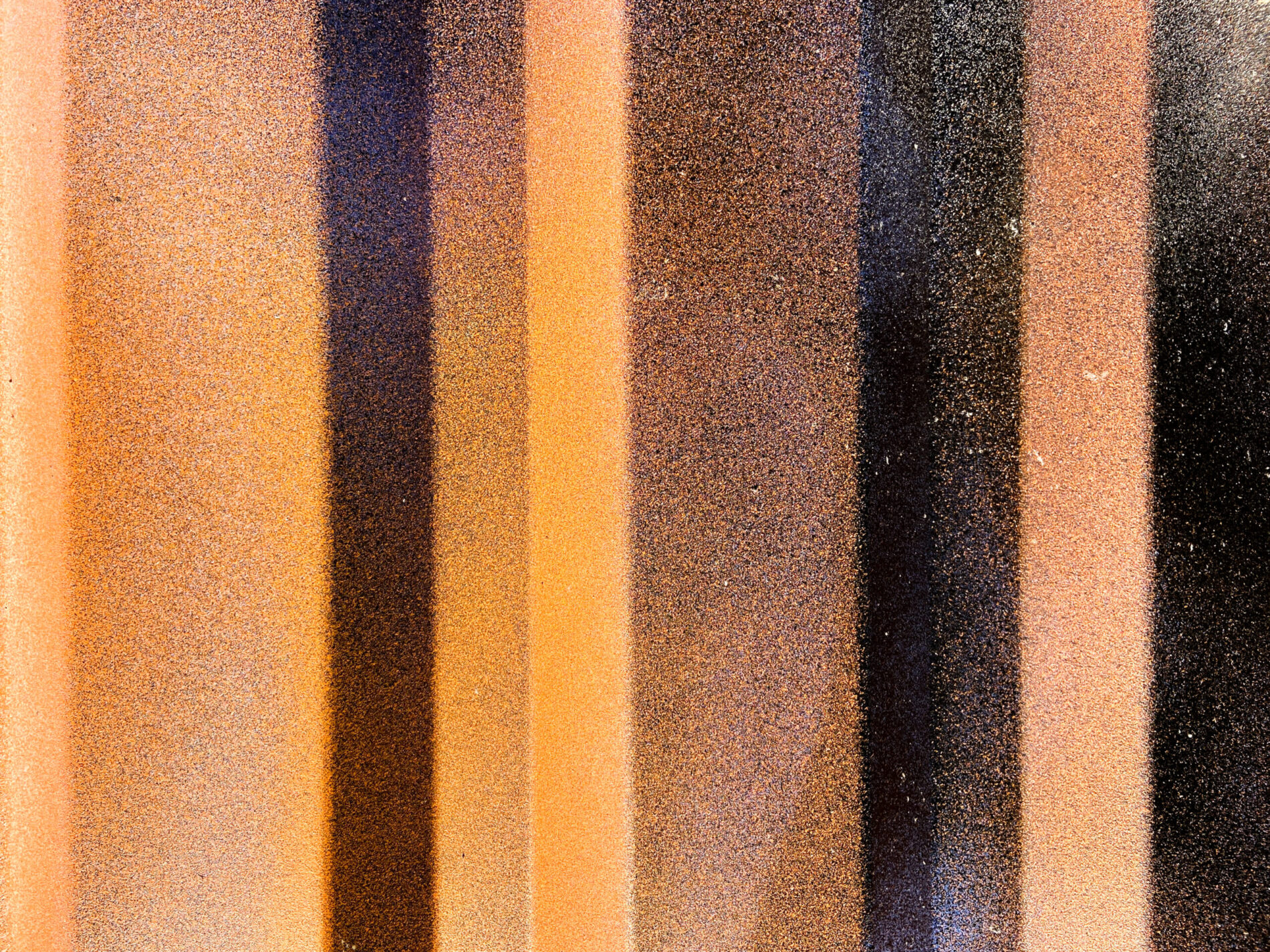
Some of the most powerful graffiti i’ve seen actually have almost no bright colors. I have a special place in my heart for neutral colors and dynamic lines. There’s nothing like exploring the power of gradient steps and textured walls.

