Leading the Design & Creative Direction: Building a Hybrid Brand Architecture
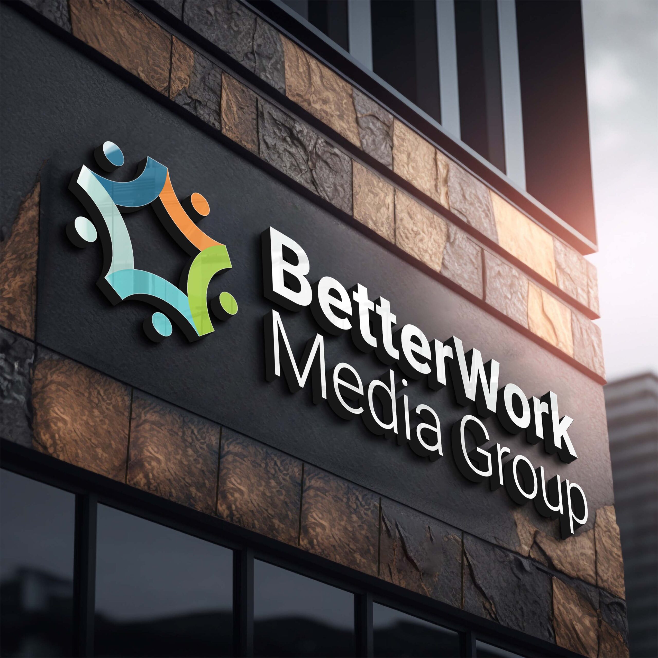
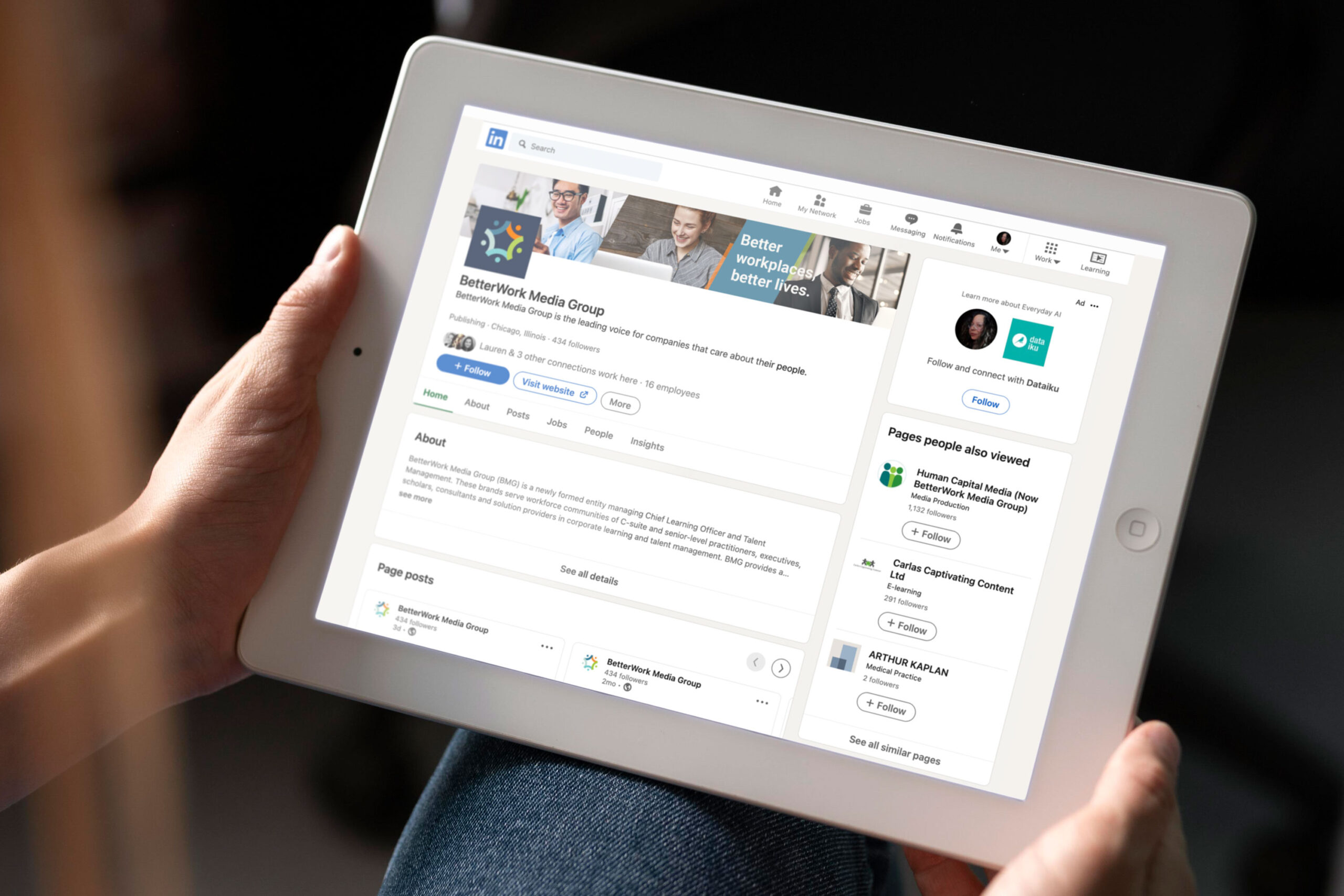
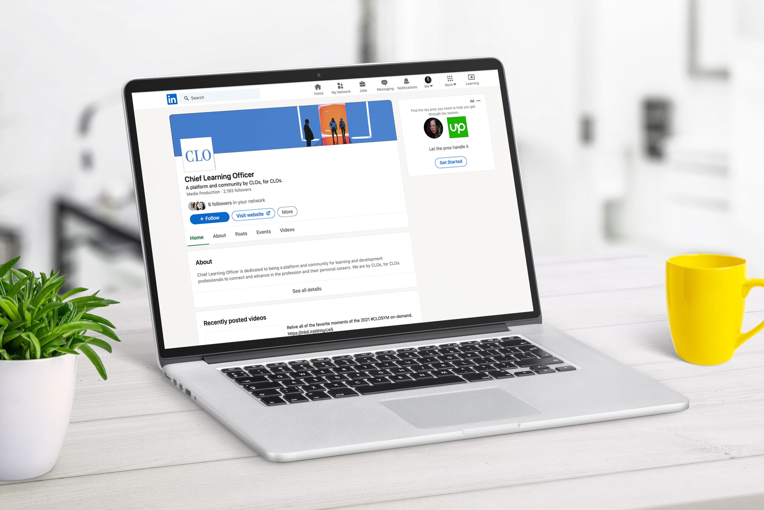
BetterWork Media Group (BMG) is a newly formed entity managing Chief Learning Officer and Talent Management. These brands serve workforce communities of C-suite and senior-level practitioners, executives, scholars, consultants and solution providers in corporate learning and talent management. BMG provides a unique platform to connect, support and empower these communities via award-winning content, research, events, webinars and digital media. BMG’s founders have more than 70 years of collective experience in the media industry. BMG is the leading voice for companies that care about their people. Better workplaces, better lives.
✨ The Impact ✨
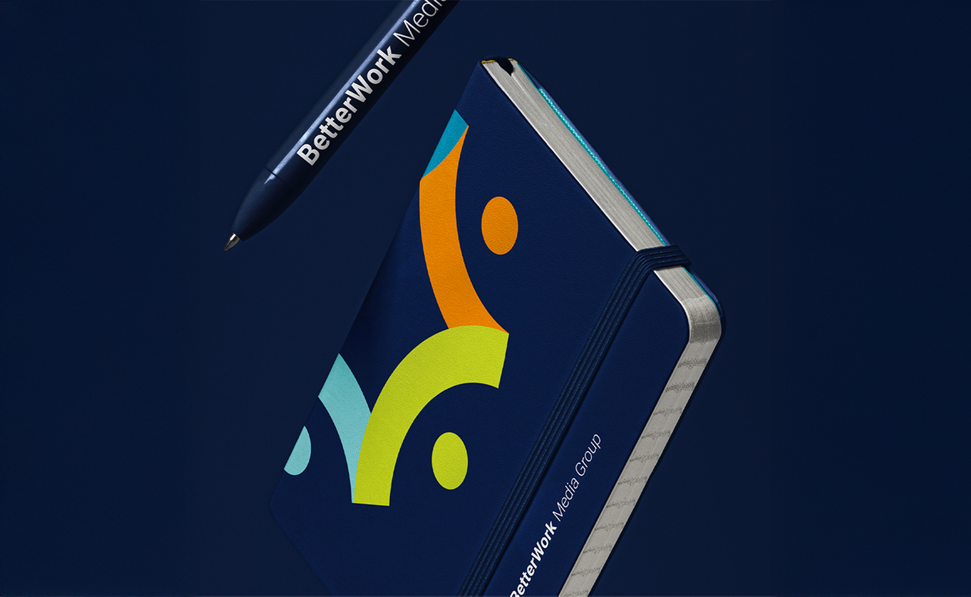
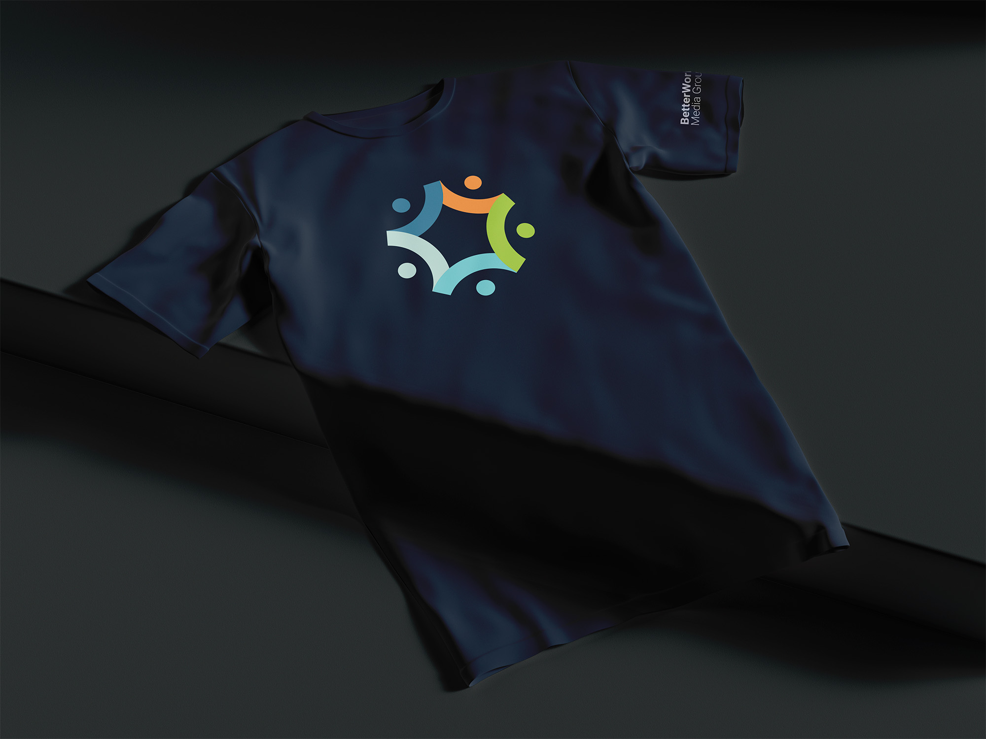
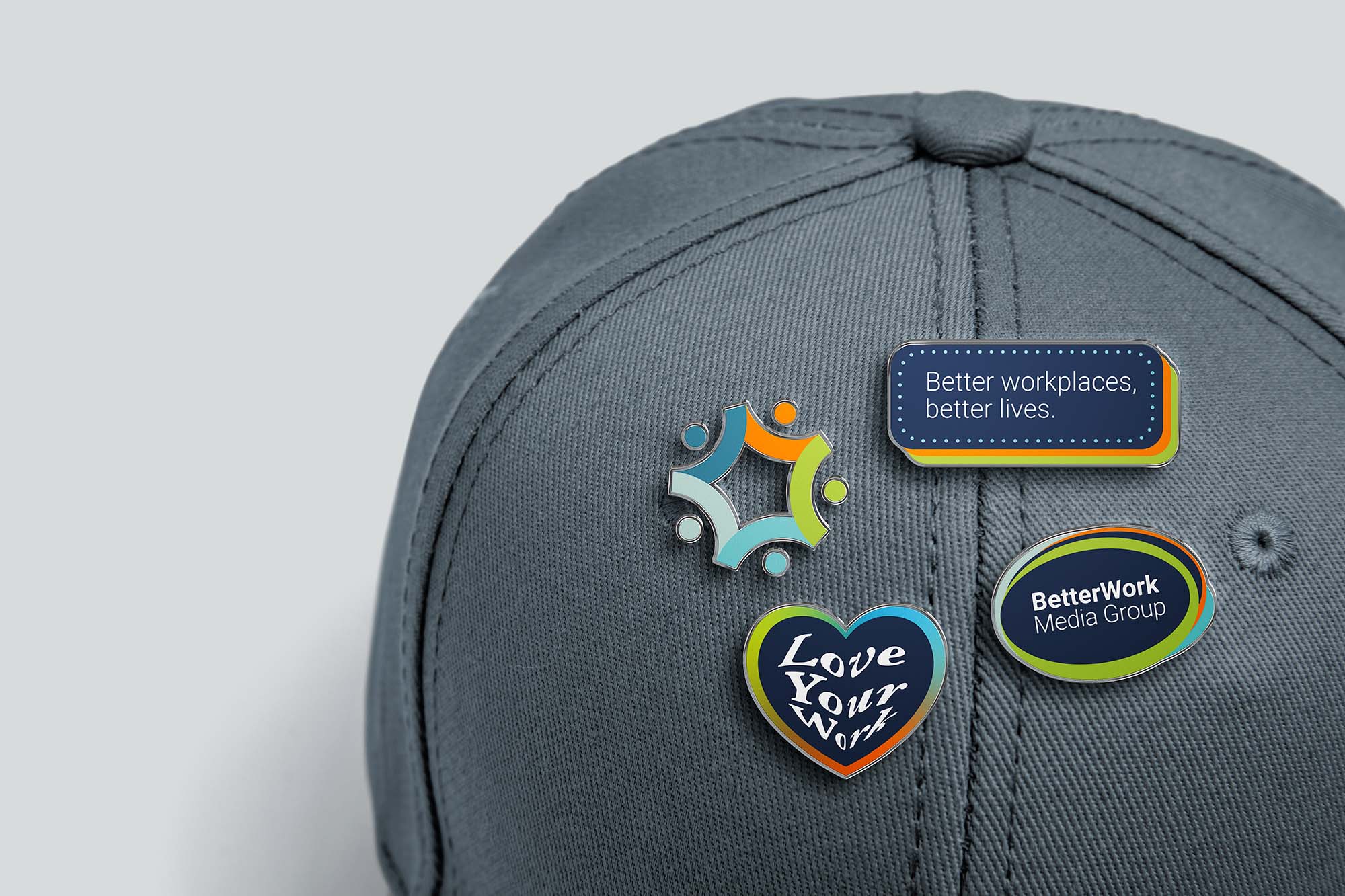
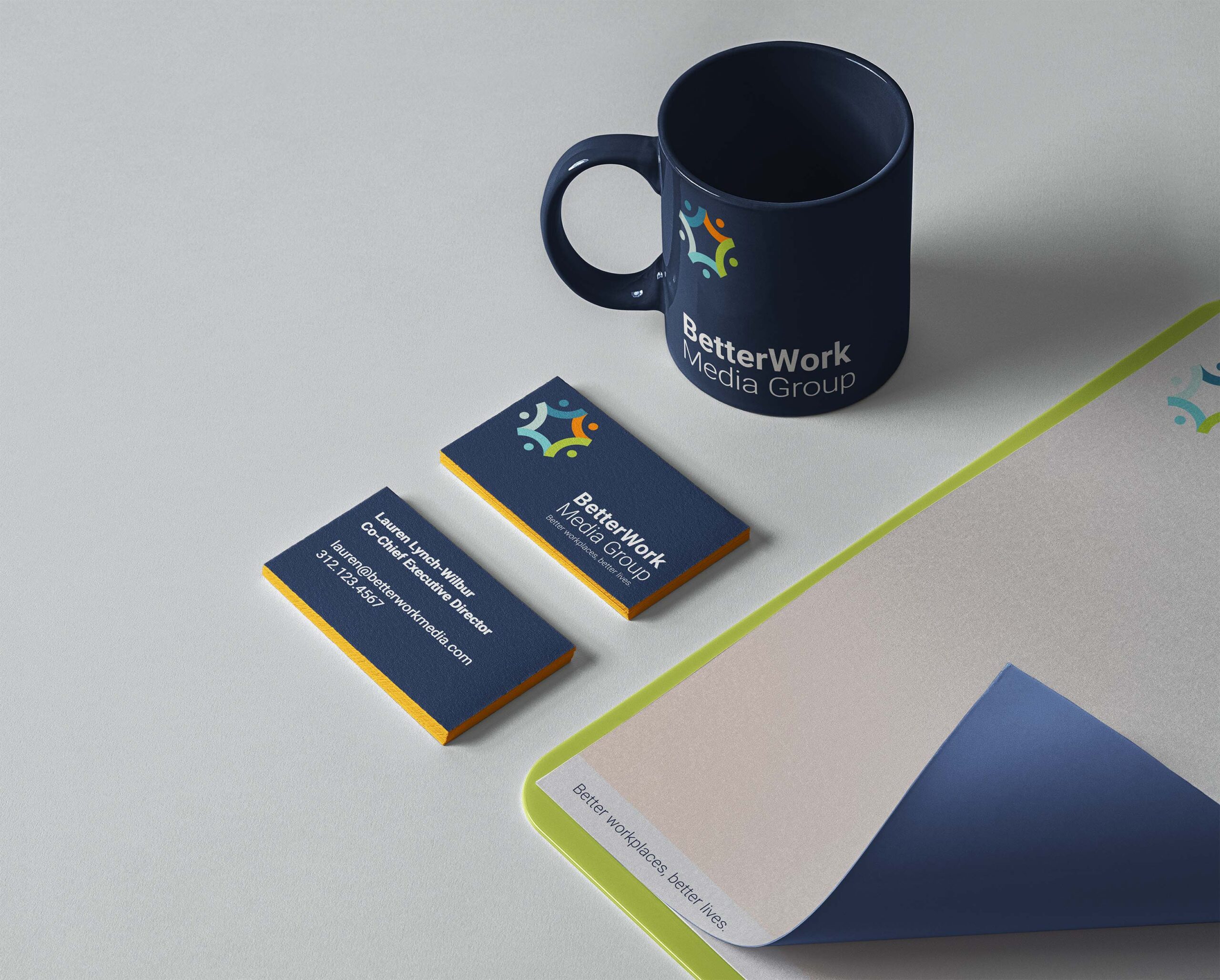
Brand System Transformation: Led complete creative overhaul post-acquisition, establishing scalable brand guidelines, visual identity, and template libraries across all touchpoints. Built reusable design system enabling consistent brand expression across web, social, print, and in-person events while managing hybrid brand architecture (house of brands with internal branded houses).
Performance & Engagement: Boosted email CTR by 52% through strategic redesigns and content optimization. Drove 12% increase in organic reach and 15% lift in paid media engagement. Successfully retained 20-year-established audience during rebrand transition, maintaining trust with C-suite and senior-level practitioner communities.
📌 Brief
The BetterWork Media Group (BMG) owners wanted to rebrand from their previous association as Human Capital Media (HCM). Their goals included: retaining their audience while providing relevant and educational content. Their focus was to create energizing marketing splash pages and digital marketing campaigns for virtual events. BMG’s rebranding launched a new digital presence that encompassed all of their branded content: Chief Learning Officer (CLO) and Talent Management (TM). This would be categorized as a hybrid brand architecture due to the fact that there was both a house of brands under BMG but each of those contained branded events, which is typically referred to a branded house. So this was a case of a house of brands with branded houses.
🔍 My Research & Ideation
- I wanted to keep the brand identity as simple as possible while still incorporating a lot of colors promoting a balance of clean design and playfulness
- BMG’s business offerings weren’t finalized; So I had to be agile, working with old branding and content during the transition
- BMG focused on creating better lives through a better workplace experience, so I lead with candid and engaging portraits of people enjoying their work and networking with thought leaders in their field
- I wanted to incorporate diversity constantly through both photography and illustration choices
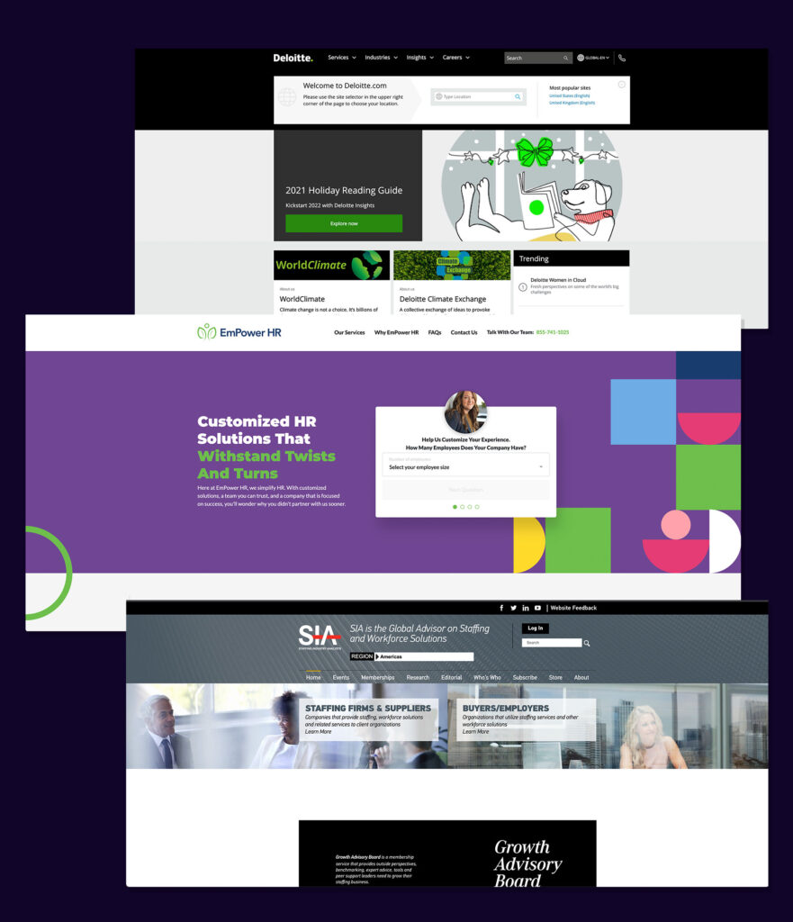
- I created a competitive analysis board of similarly functioning businesses
🛼 Creative Challenges
- The owners wanted to rebrand as BMG and refresh other brands. They didn’t want to lose the familiarity with the audience they built over the past 20 years, particularly Chief Learning Officer and Talent Management
- The rebrand needed a shared color palette and typography kit that allowed a slow transition to a new look/tone/feel
- Brand Guidelines were needed in the interim to be flexible and grow as the business objectives solidified
- I needed to adjust my approach to my working process, specifically in handing off the wireframes and templates to a third party for development
- Event pages linked to third party retailers to complete registration or purchase digital archival pieces including white papers and ebooks
💡 Creative Solutions
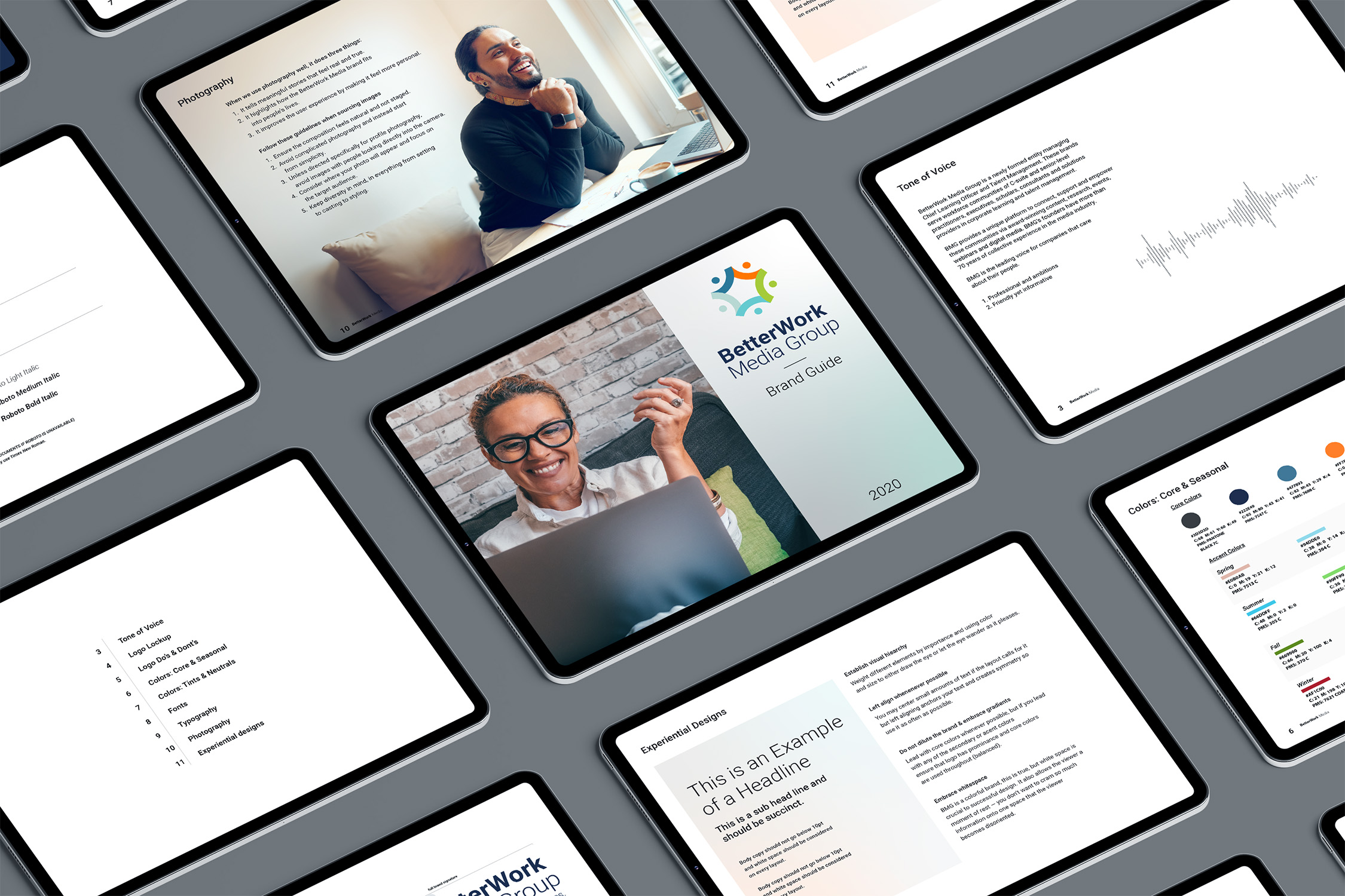
- I used a prioritization matrix to create a multi-brand guide book with brand sections that allowed specific use of color and typography to create a sense of consistency; The guide book included: logos, landing pages, email templates, digital ads, event marketing, and white papers
- I created a versatile color pallet that included seasonal colors, tints, and shades with shared colors across all brands
- Typography should feel bespoke but also work together; I created a type library which shared the Roboto family across the brands and used Roboto Slab and Kazimir fonts as accents
- I applied research from available surveys, interviews, and key insights from Human Capital Media’s research department to organize web content and ensure the target audience received information efficiently
- I created prototypes for scrolling and menu functioning on certain pages to assist the third party developers
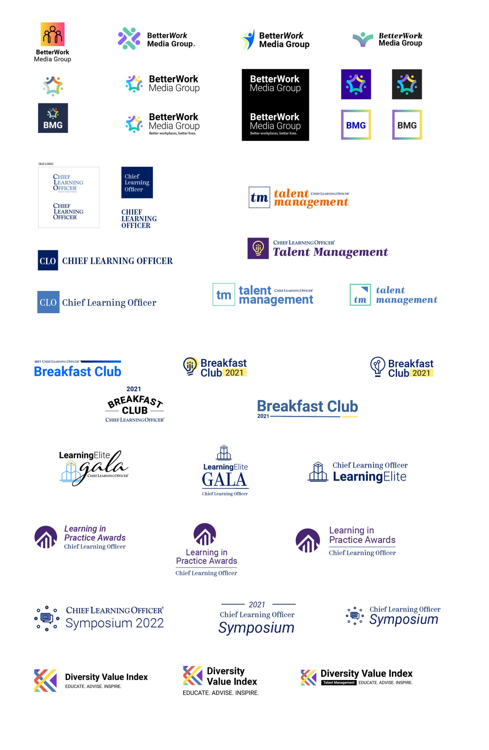
✍🏽 Logo Design Iterations
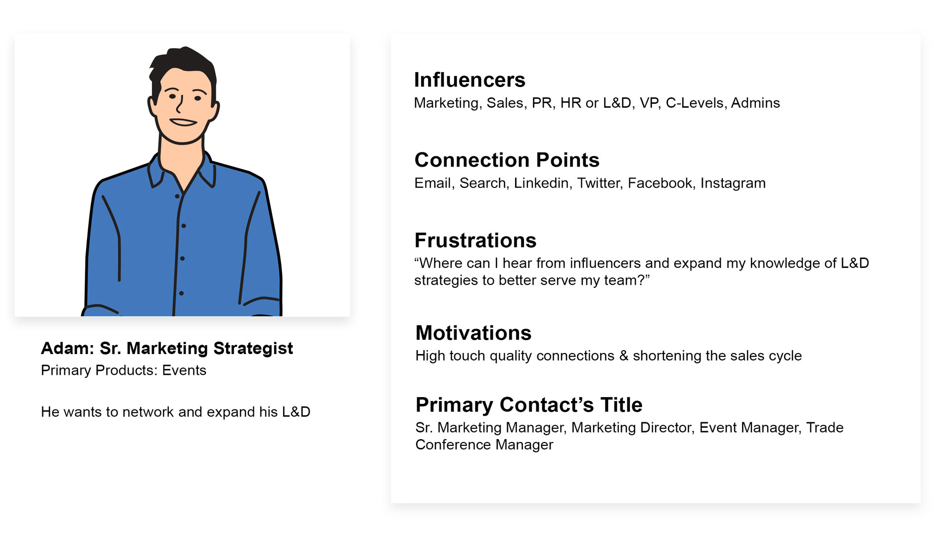
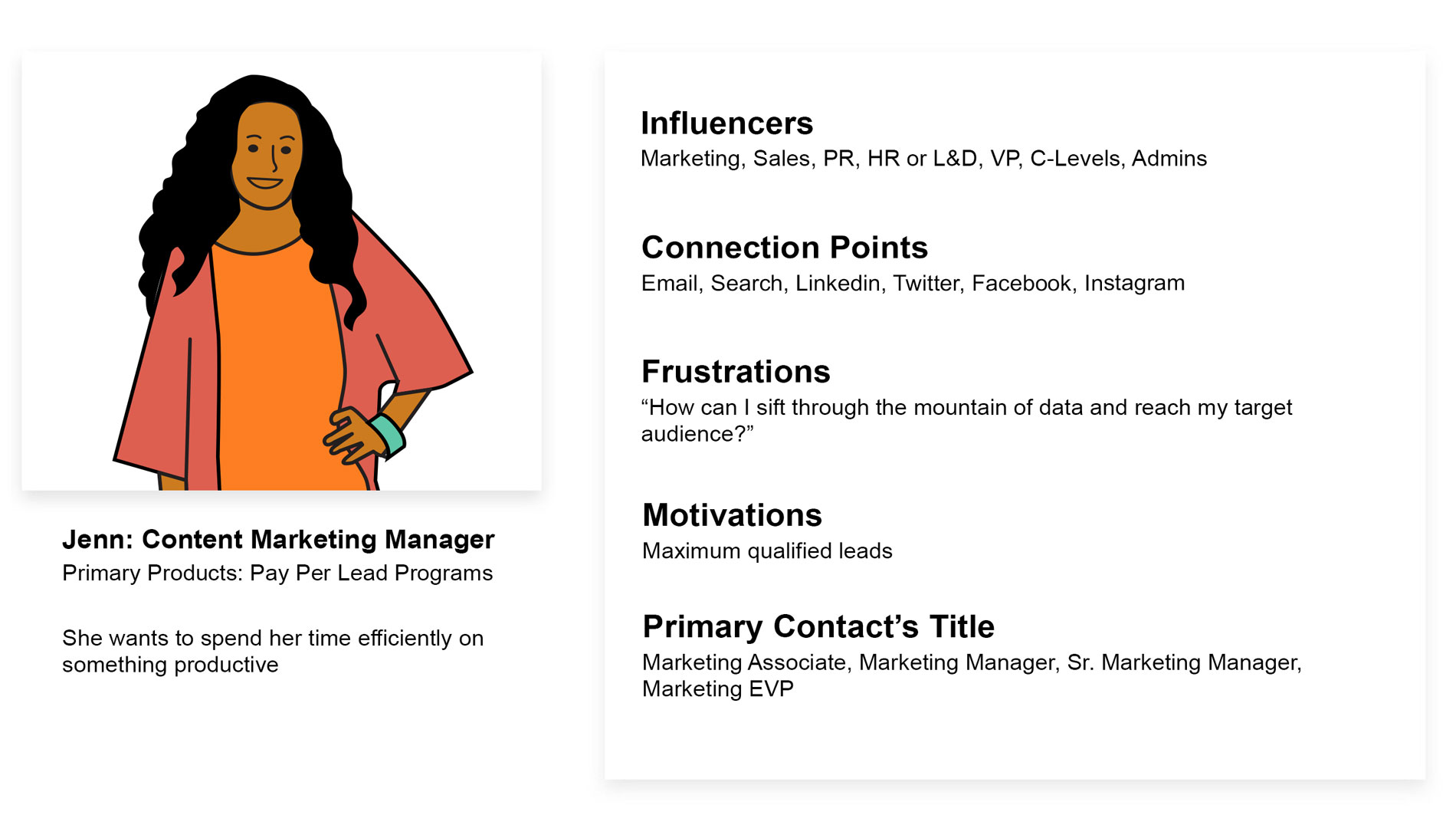
🤌🏽 User Personas
Our objective was very clear: the target audience trusted that BMG would continue to provide essential and informational content that would help them better manage their teams, influence key stakeholders, and make informed decisions based on research—all while being engaged and energized.
🧠 User Flows
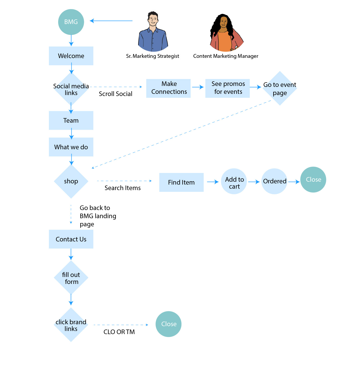
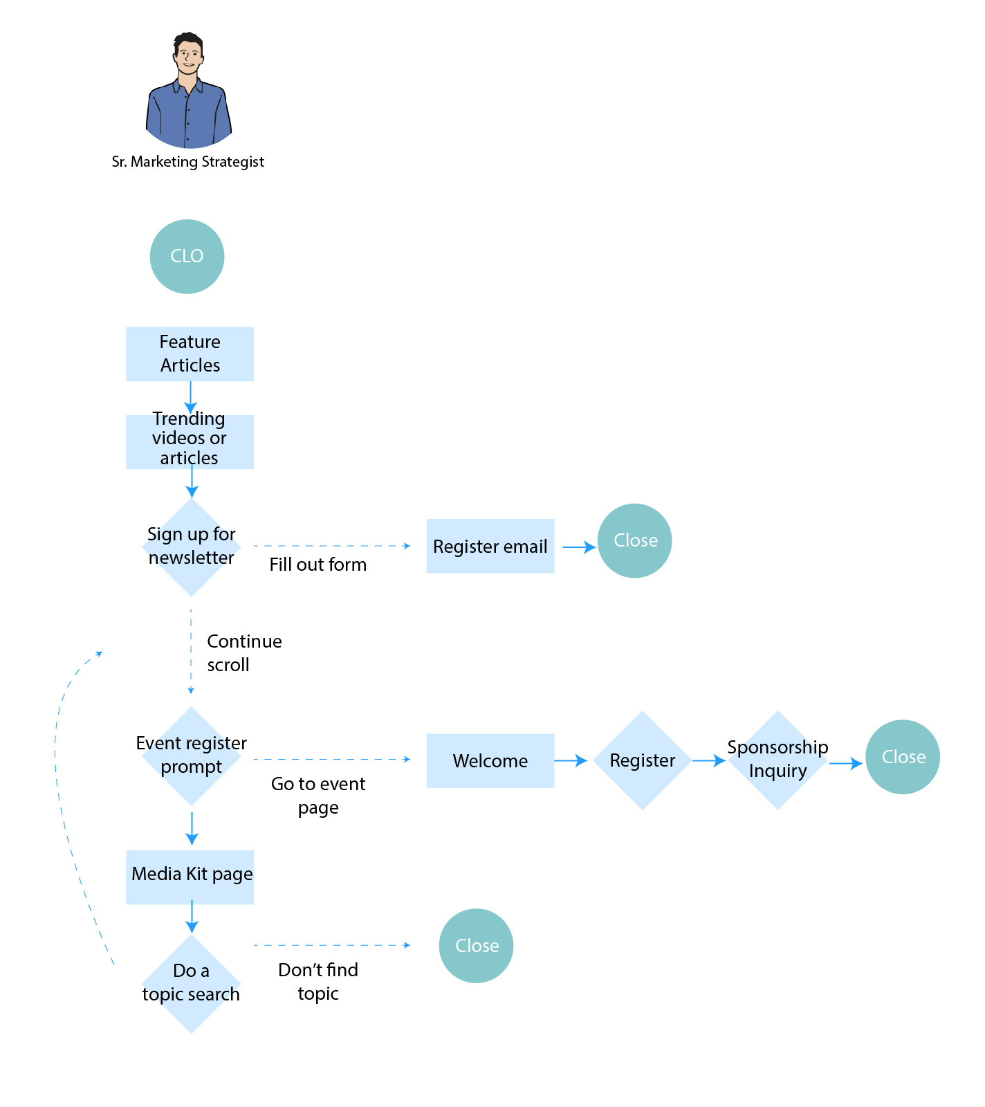
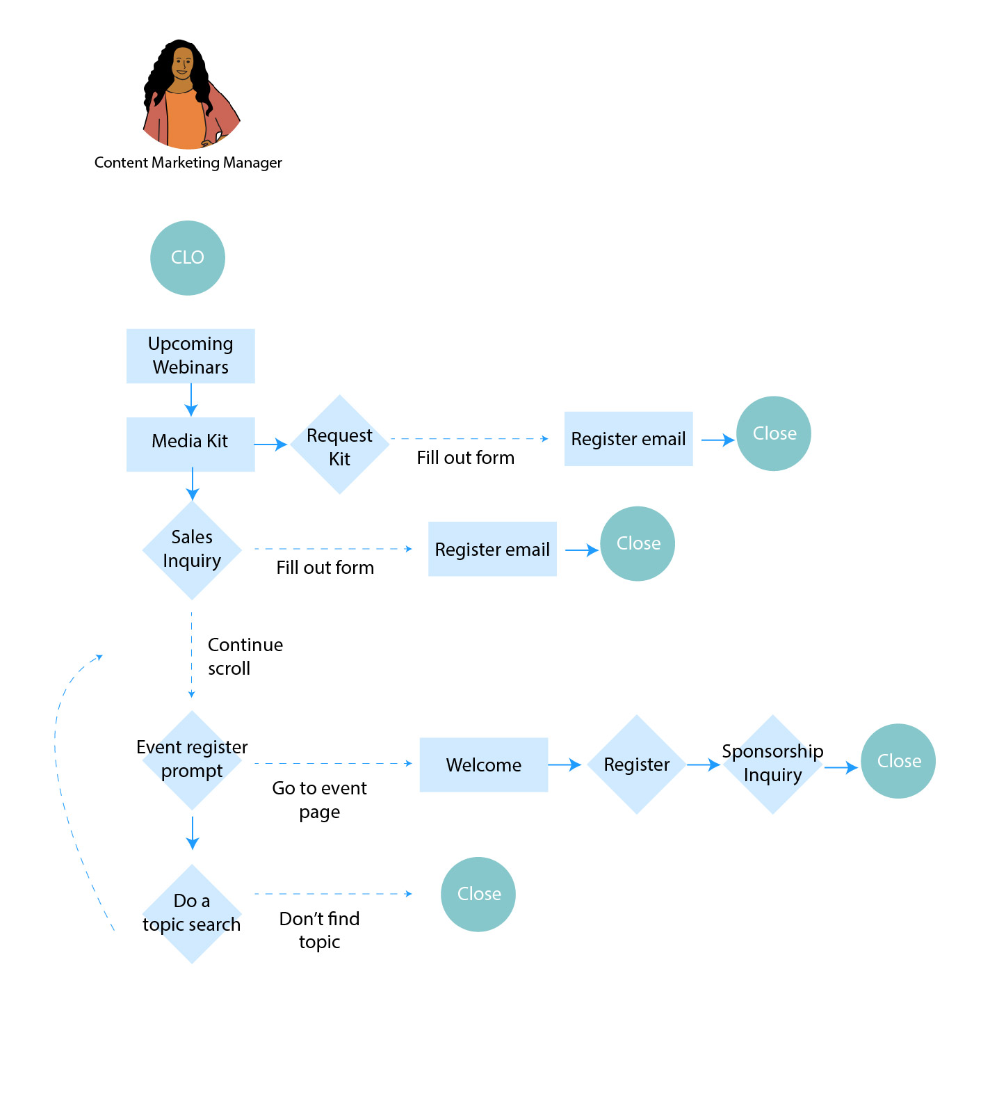
Produced a user flow chart to make sure I designed appropriate wireframes. To have a great experience the designs needed to remove any endless sorting and allow the user to reach specific information content with ease. These flows only included BetterWork Media Group landing one page and Chief Learning Officer landing page (Talent Management was still being processed at this time and was lower priority).
When designing, I often logged in a remote screen sharing session with research team to discuss how to turn insights from research into design changes. They acted as a voice for the members whilst creating new iterations.
🕸 Site Map
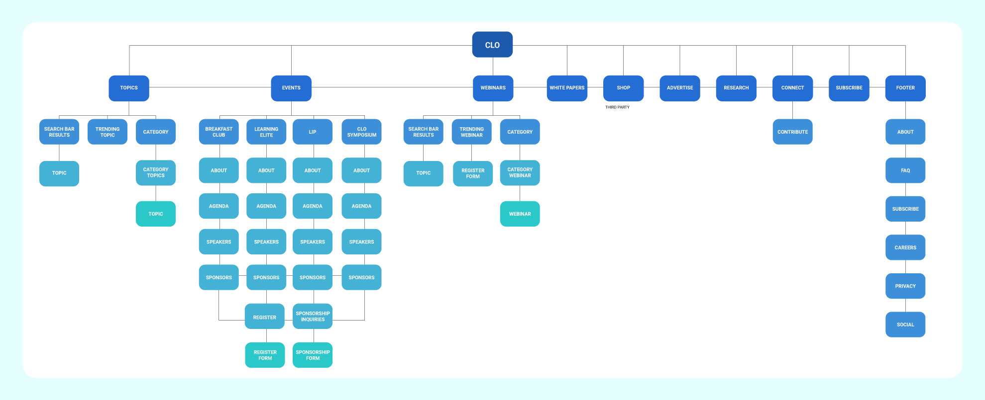
In tackling the design challenges for BetterWork Media Group, my approach was centered on clarity and user-centric design. Starting with Chief Learning Officer’s website, I recognized the need for a comprehensive site map to guide the user journey effectively. This large map was meticulously crafted to address the diverse needs and touchpoints of the website, ensuring every user interaction was intuitive and purposeful.
For BetterWork Media Group, the challenge was different. Their digital presence was streamlined, encapsulated in a single-page website with just one external link leading to a third-party e-commerce platform. Here, the emphasis was not on navigating through multiple pages but on creating a focused, impactful user experience on this solitary page.
✏️ Lo-Fi Sketches
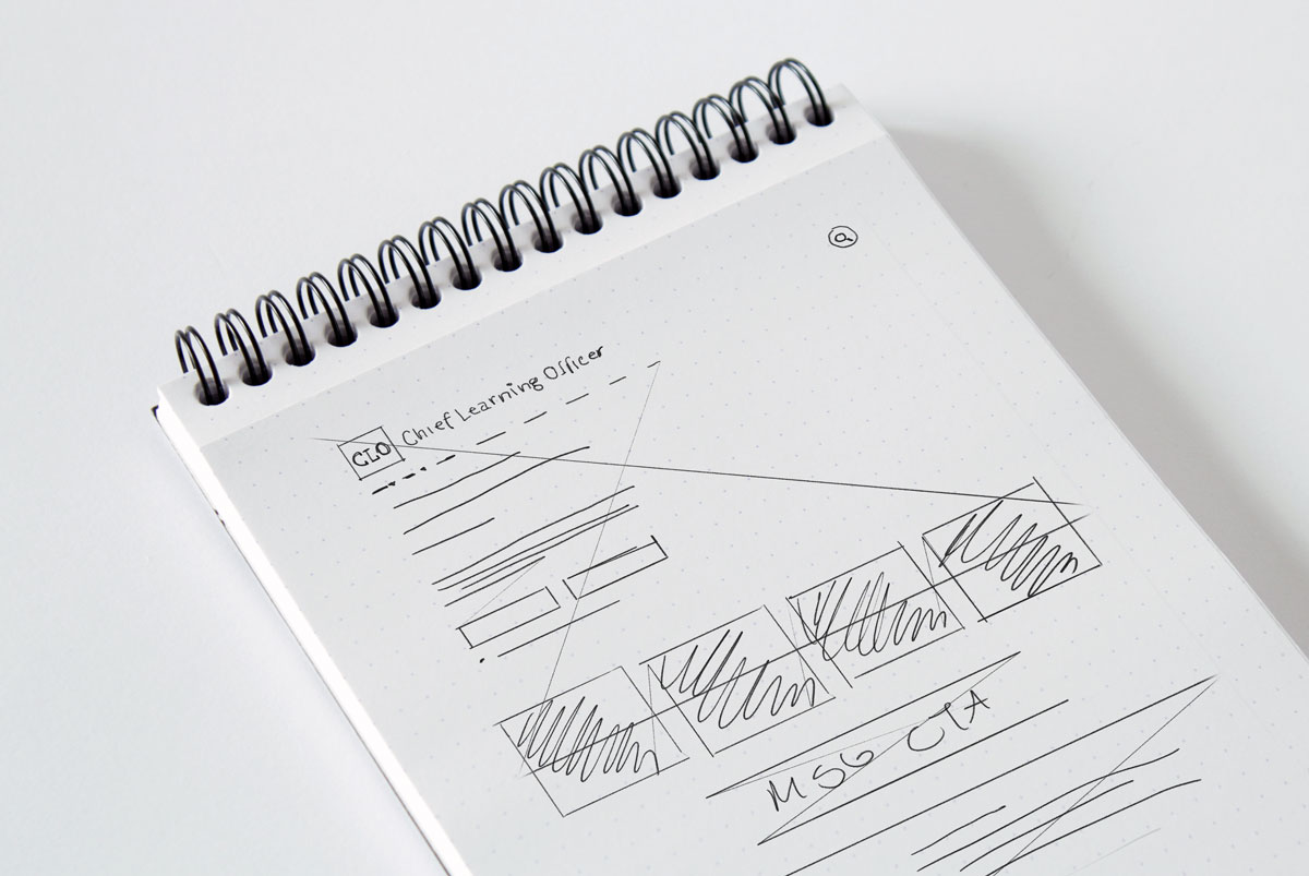
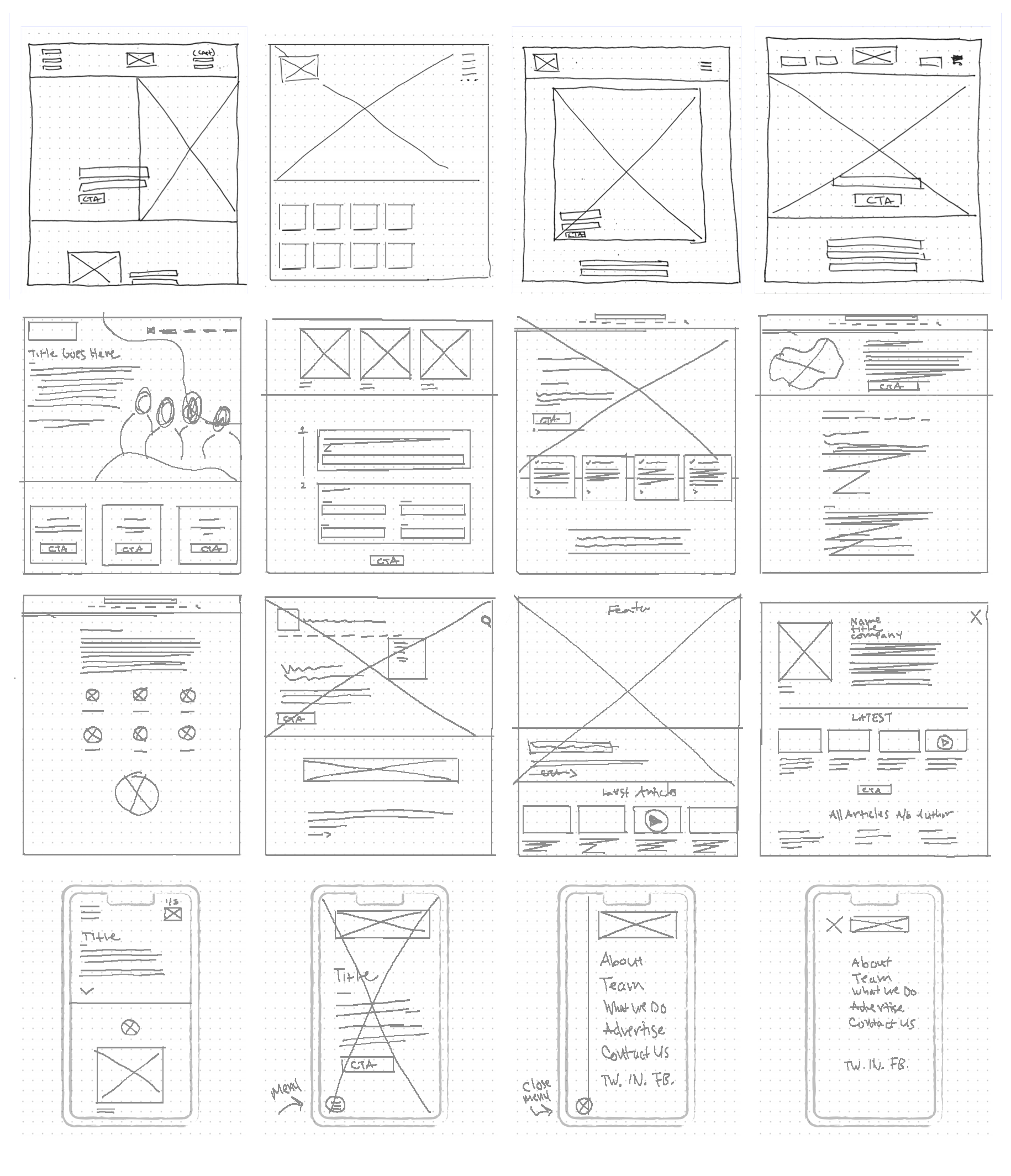
To lay the groundwork for these diverse web environments, I began with lo-fi sketches and rough wireframes. These initial drafts were instrumental in shaping the final designs, allowing me to experiment with layout and flow without committing to high-fidelity details too early. It was during this phase that I employed the principle of ‘Complexion Reduction.’ This UX strategy is all about simplifying the visual elements of a design to enhance usability. By reducing complexity, I aimed to streamline user interactions, making the websites not only aesthetically pleasing but also exceptionally user-friendly.
Complexion Reduction was particularly effective in breaking down longer tasks into manageable steps within the landing pages. Each page was designed to give context and guide users smoothly, with clear calls to action and easy navigation. This approach also meant that if a user accidentally clicked the wrong link or wanted to revisit a previous section, they could easily find their way back without confusion or frustration. In essence, the designs were intuitive, inviting users to explore and interact with the content effortlessly.
🖼 Wireframe Iterations
⚡️ Visual Design
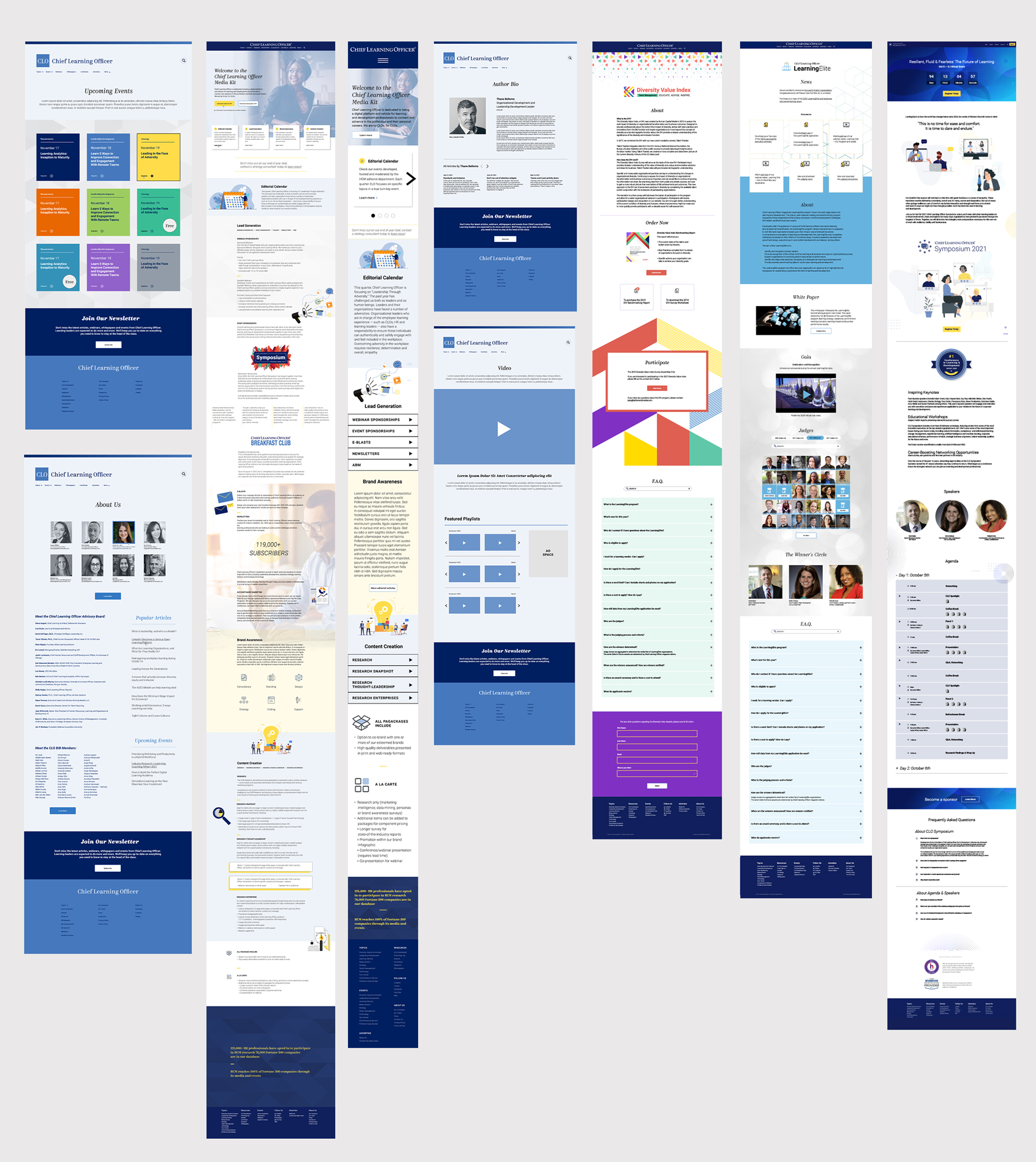
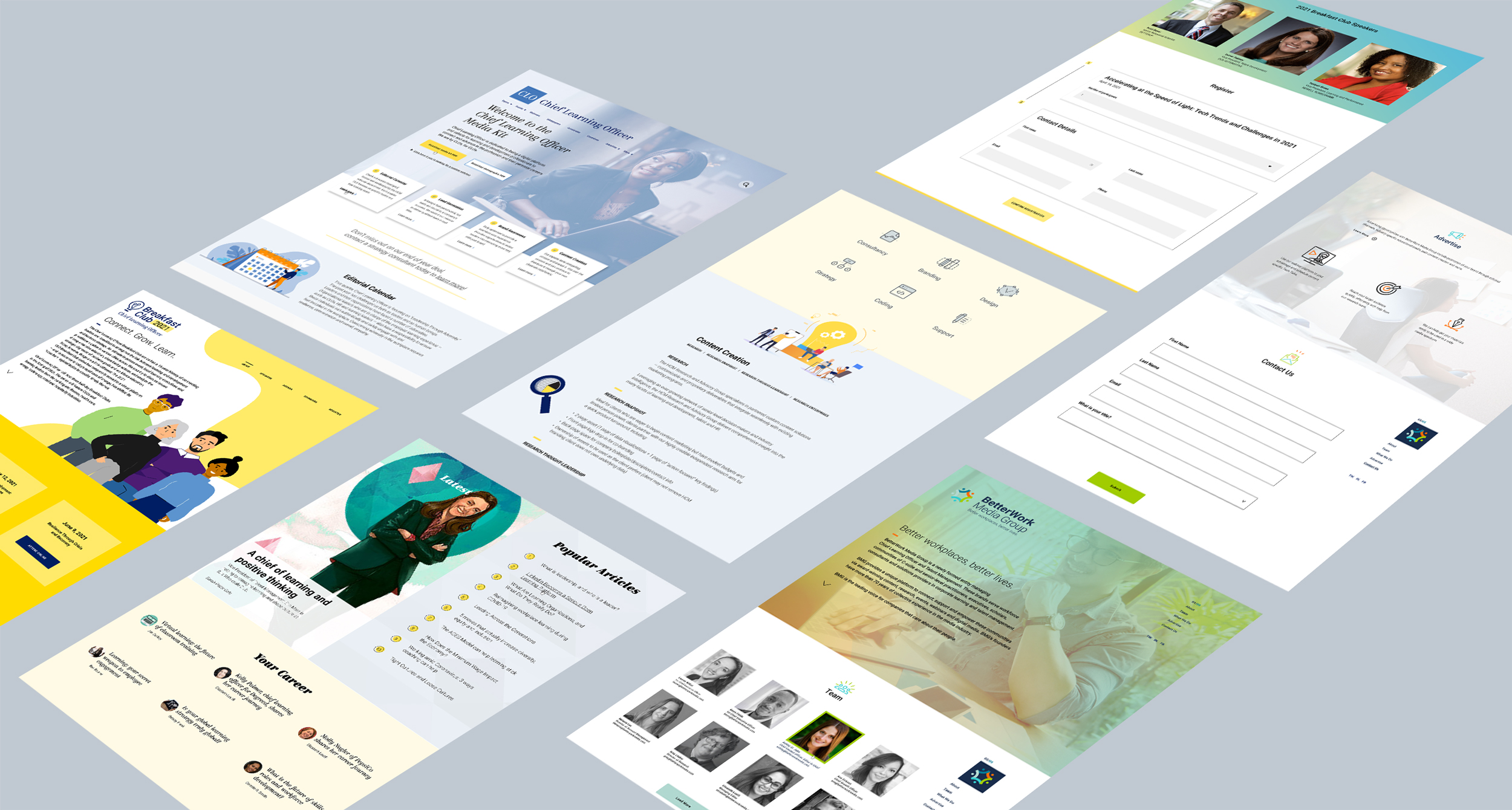
After Sketches, wireframes and feedback from research, I produced multiple website layouts for different types of event campaigns and company branded pages. I approached all the post-click landing pages with a z-pattern layout which really focused on the call-to-action. Some of the requested layouts were handed off as templates per the client’s request to submit to a third party for development.
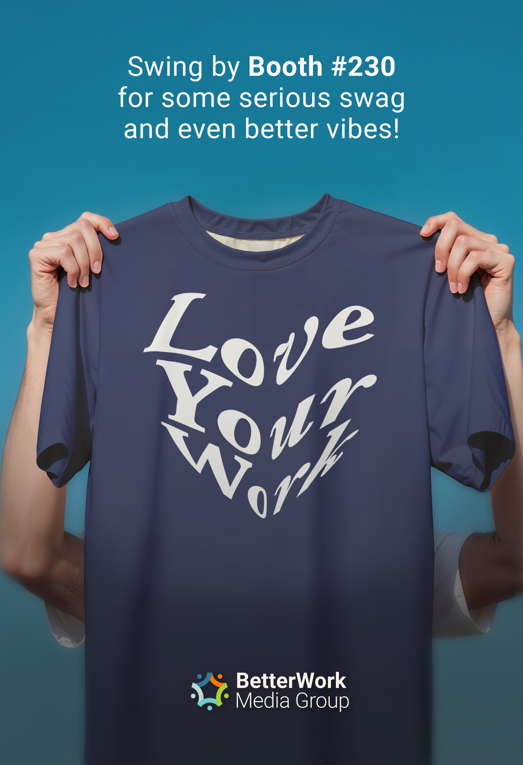
👩🏽💻 BetterWork Media Group: Booth Concept
🎉 BMG Branded Presentation Template
Building your visual brand identity is all about creating a consistent presence for your audience, clients, and partners, right down to your presentations. I crafted presentation design templates for BMG that are easy to use and update as needed. Included some copy to help users avoid blank page syndrome, but there are some filler texts with Lorem Ipsum that internal teams can customize to their specific needs.
- Role Design Director
- Date 2018-2021
