Boldly Jewelry: Make Mixed-Metal Jewelry Feel Aspirational, Not Exclusive
✨ The Impact ✨
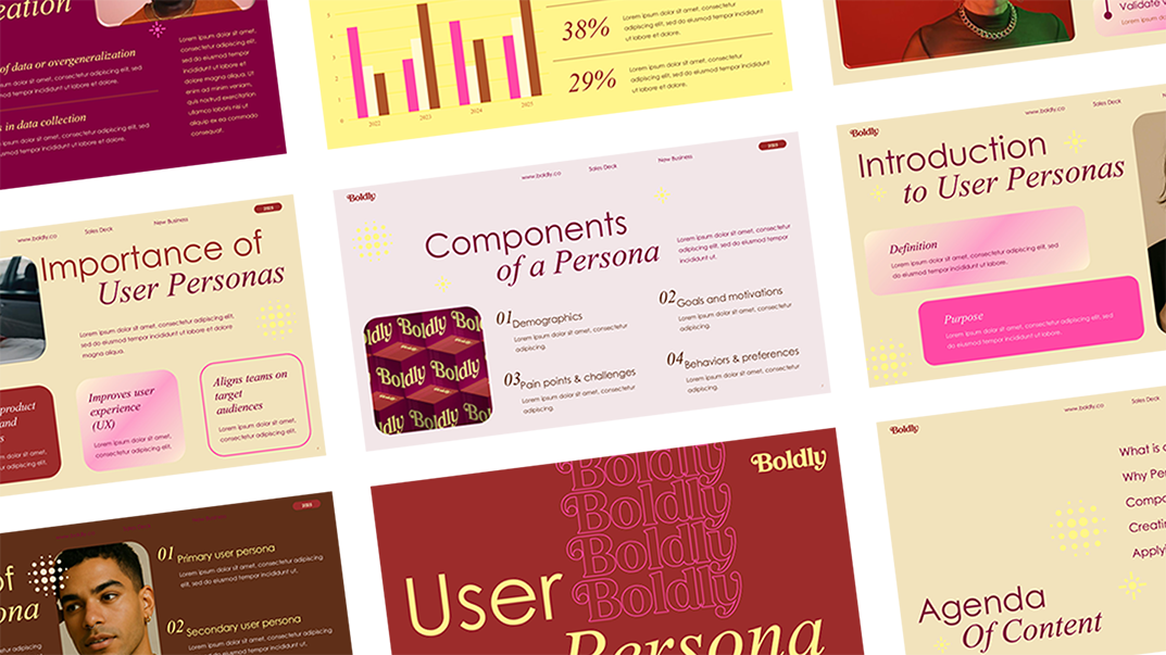
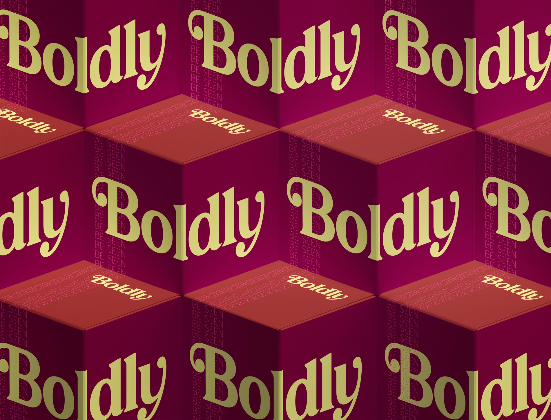
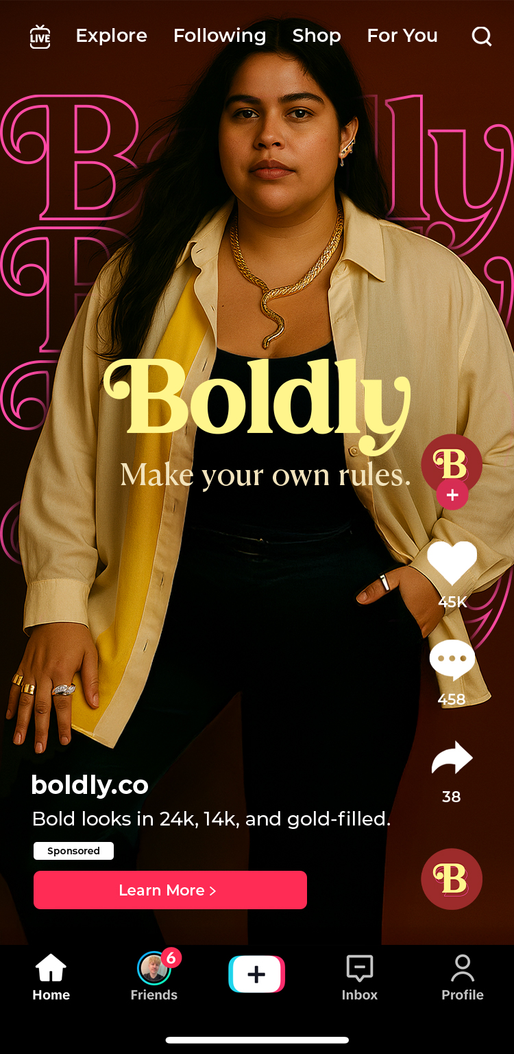
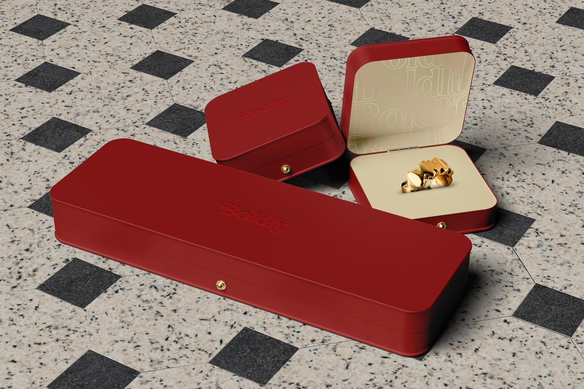
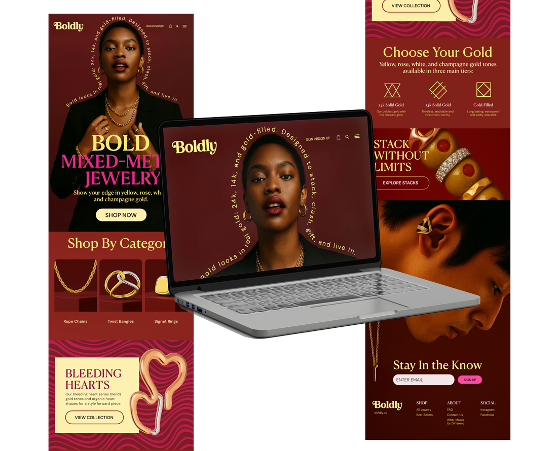
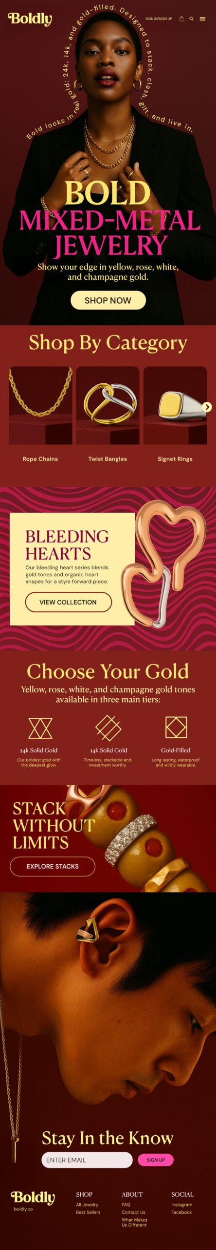
What Was Delivered: Brand manifesto (positioning, voice, messaging pillars) + visual identity package (8 logo variations, 12-color palette, typography system, pattern library) + website design (homepage + 12 key page templates) + social content system (25 post templates for Instagram/TikTok) + packaging design concepts (3 box formats) + brand guidelines (40-page starter guide).
Business Value Created: Established ownable visual language in crowded category. Positioned brand to capture underserved 25-40 demographic seeking accessible luxury. Built scalable foundation enabling fast product launches without design bottlenecks. Set brand up for phase two: full system buildout with expanded templates, seasonal campaigns, and in-house team enablement.
📌 Brief
Boldly set out to redefine accessible luxury, making high-quality, mixed-metal jewelry feel aspirational yet effortless. The goal: create a brand experience that speaks to the desire for self-expression, individuality, and versatility while maintaining a premium feel across both luxury and accessible options.
Boldly’s collection includes both high-end fine jewelry and the same styles offered in 14K to 24K gold-filled versions—never gold-plated. The assortment spans yellow, rose, white, and champagne gold, embracing the full spectrum of modern luxury. The brand needed to communicate that style shouldn’t be gated by price tags—it should be worn, stacked, and styled without limits.
To succeed, the brand had to reach a new kind of luxury customer: one that values boldness over status, expression over tradition, and personality over perfection.
👨🏽🎤 Creative Process
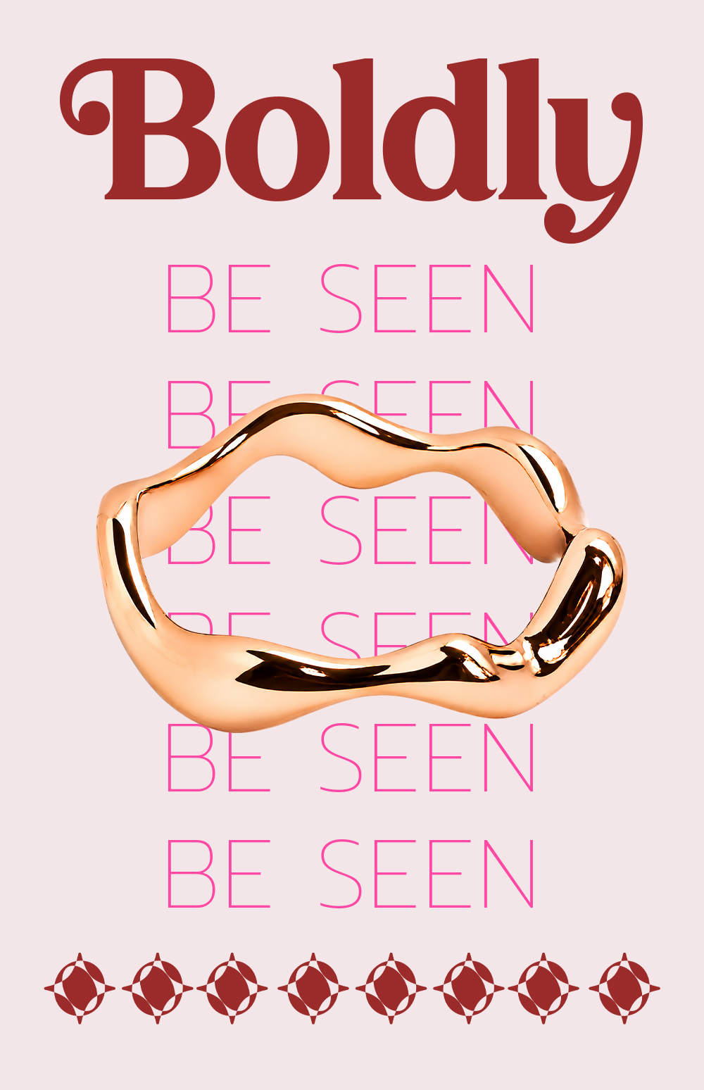
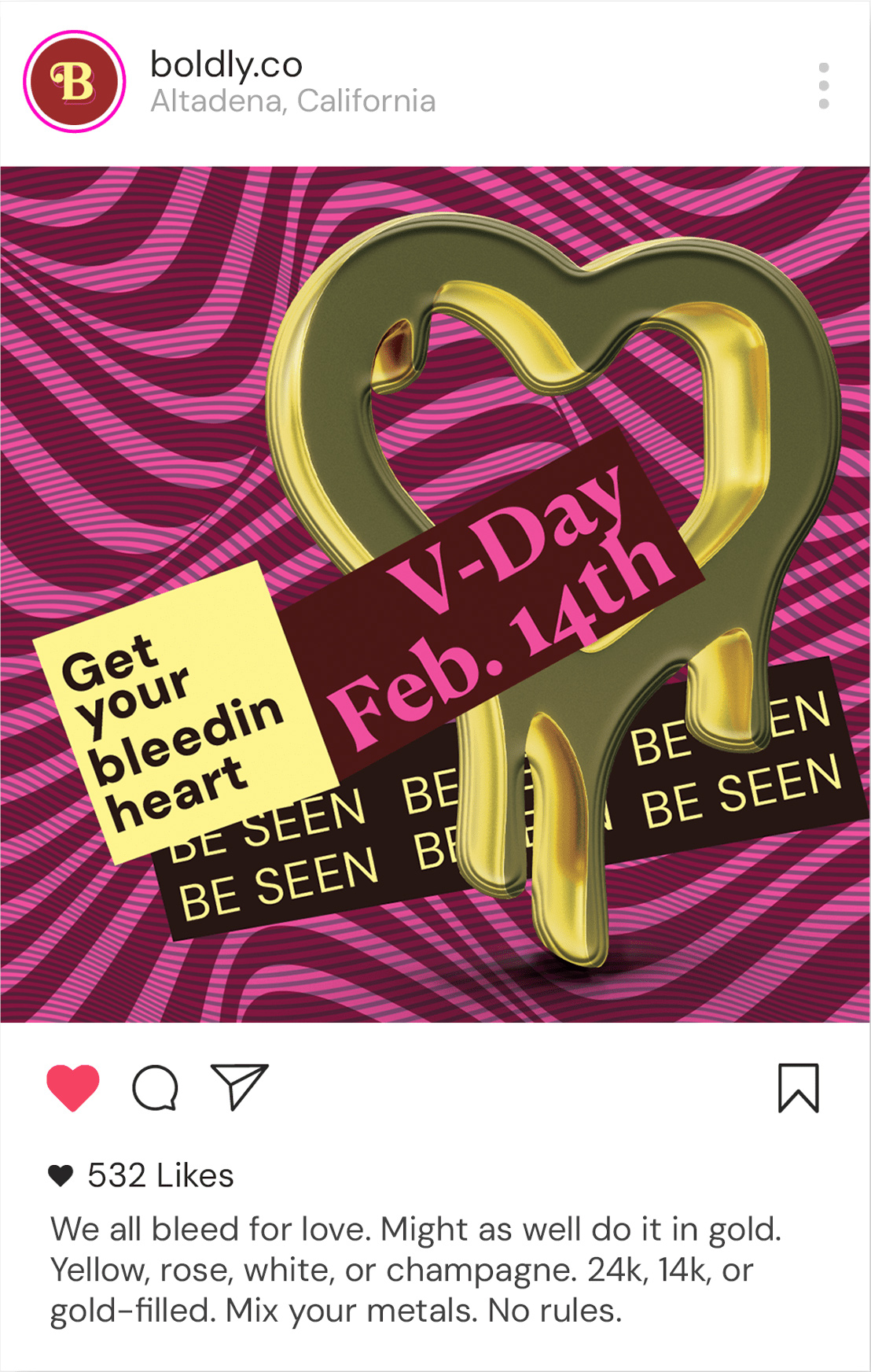
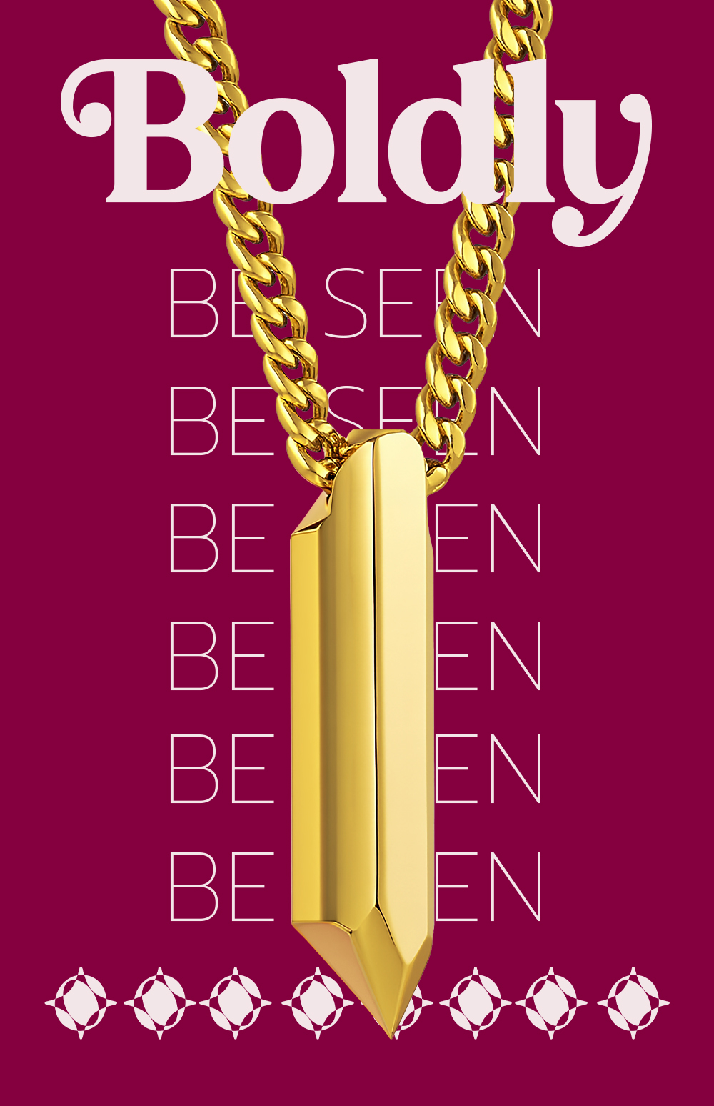
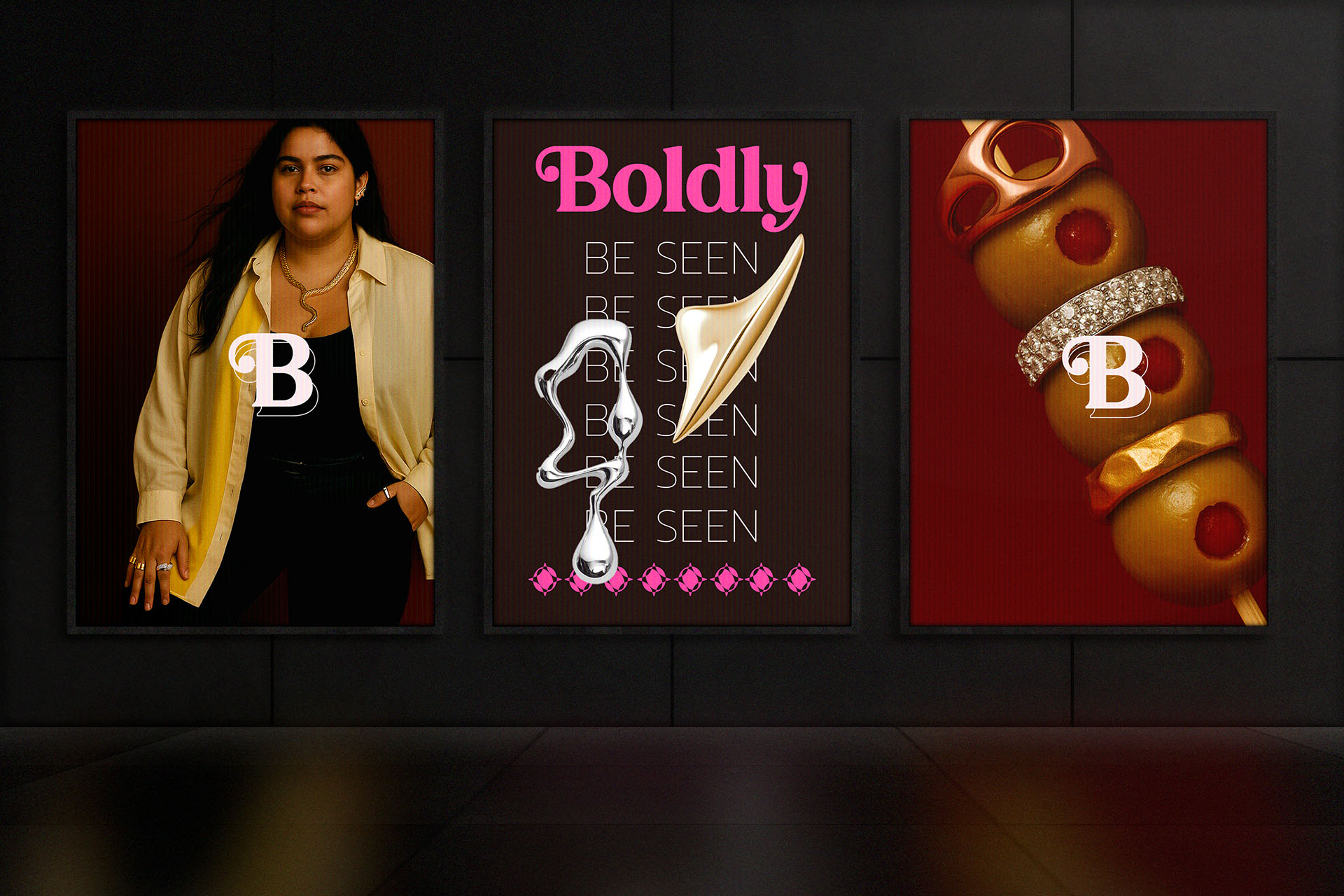
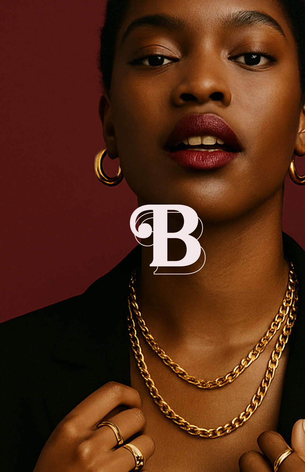
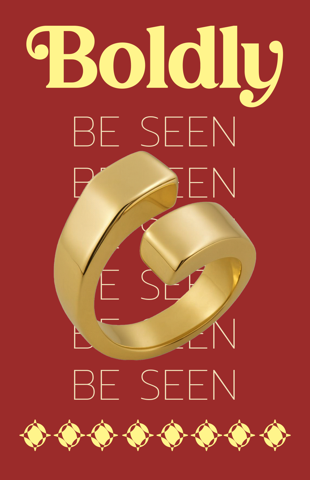
From the jump, I wanted this brand to break rules: visually, tonally, and emotionally. Boldly doesn’t whisper luxury; it makes eye contact and winks. I shaped a visual system rooted in contrast: punchy magentas and golds, sharp editorial typography softened with drippy textures, and layered gradients that feel as fluid as the jewelry itself.
We leaned into cultural fluency and Gen Z/millennial crossover with irreverent but intentional messaging. Every campaign element, from packaging to digital, was built with scroll-stopping confidence. I worked with the creative team to storyboard campaign concepts, art direct product photography, and define the visual tone across social, site, and out-of-home placements.
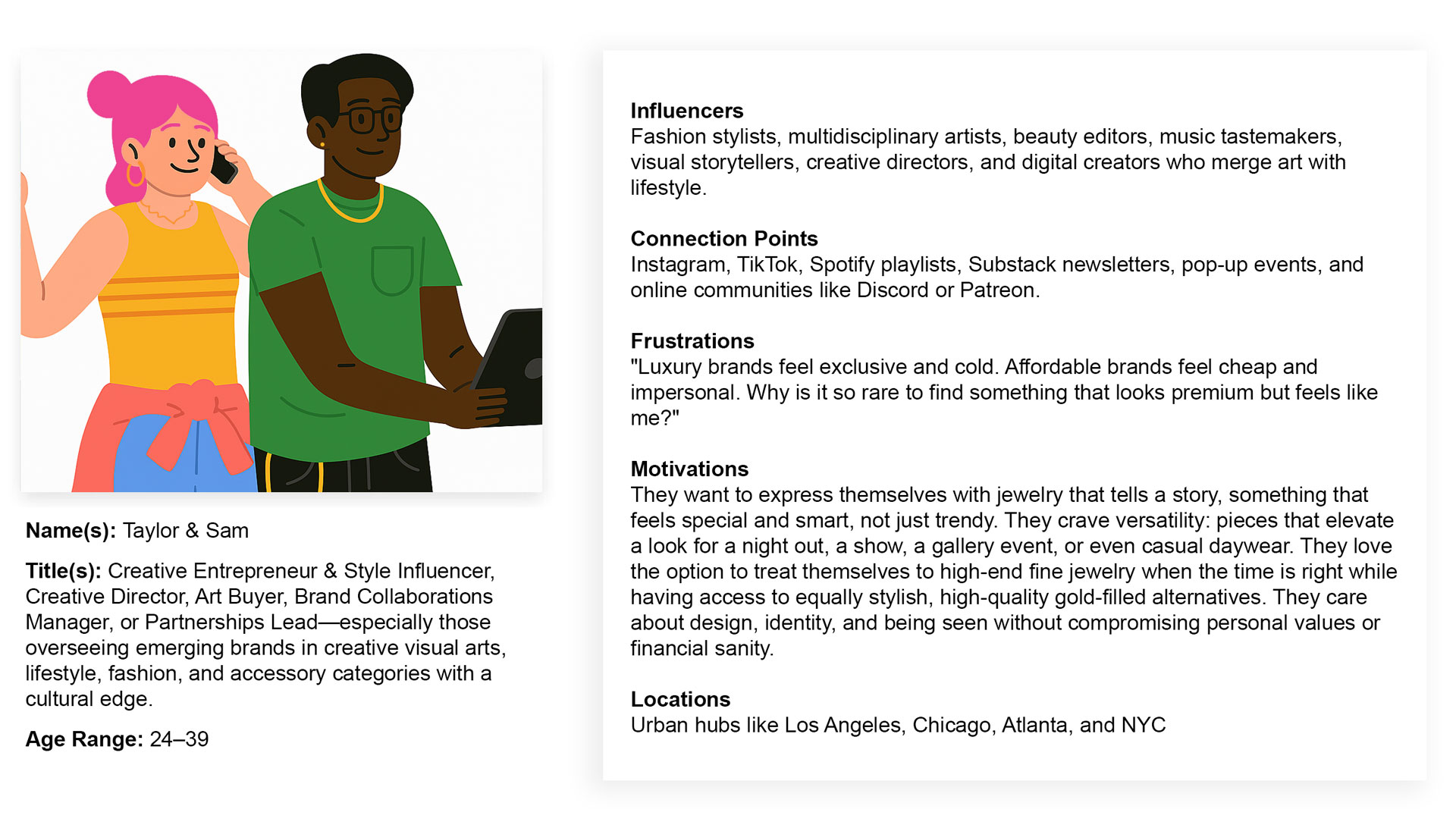
🤌🏽 User Personas
Boldly’s audience isn’t buying tradition—they’re buying identity.
We crafted the brand to connect with The Edge Seekers: style-forward Gen Z and Millennial creatives, content creators, and fashion-minded individuals who use jewelry to express emotion, not status. They’re the ones mixing Zara and vintage Margiela, stacking rings like armor, and pairing white gold with yellow because it feels good, not because it matches.
They want:
-
Jewelry that keeps up with their aesthetic shifts.
-
Options that look expensive but don’t require loyalty to luxury labels.
-
A brand that embraces duality: soft and sharp, high and low, luxe and lived-in.
These personas see jewelry as a daily extension of self, not a rare occasion. They value bold styling, premium materials, and an editorial feel that’s still accessible. We designed Boldly to speak directly to them—confidently, culturally, and without compromise.
🛼 Creative Challenges
Balancing the premium feel of a luxury product with the accessibility of a gold-filled line meant getting very intentional with hierarchy. We needed everything to feel elevated, even when it was entry-level price-wise. I refined typographic styles to support premium messaging while still leaving room for playful campaign language. We also had to build a flexible brand system that could scale across seasons, trends, and product tiers without ever feeling diluted.
⚡️ Visual Design
I created a brand that’s loud in the right ways—unexpected color pairings, layered copy treatments, and metallic accents that feel fresh, not stuffy. Photography leaned heavily into contrast: wet textures, dramatic lighting, and close-up, tactile shots that begged to be touched. We built packaging that doubled as visual merch—statement boxes in deep burgundy and cherry, with repeat patterns and foil-stamped brand marks.
- Role Brand Creative Director
- Date February 2025