Building a Scalable System: Expanding a Brand for Long-Term Use-End
✨ The Impact ✨
Team Empowerment: IACE’s team could create their own materials without waiting on designer or worrying about breaking brand. Templates and Canva setup meant they could produce professional content quickly – presentations for conferences, social posts announcing publications, webinar graphics, research updates – maintaining brand quality without external support.
Workflow Efficiency: What previously required outsourcing design work now happened in-house. Team members could duplicate templates, swap content, adjust colors within brand palette, and publish within hours rather than weeks. Reduced costs while increasing output velocity.
Brand Consistency: System ensured visual consistency across everything: research publications, educational resources, social media, presentations, webinars. Brand stayed cohesive across touchpoints, building trust and recognition in computing education research community. IACE went from having brand they couldn’t fully use to having system working with them, not against them – operational, scalable, and empowering non-designers to communicate professionally.
📌 Brief
The Institute for Advancing Computing Education (IACE) had just developed a new brand identity, but they needed help making it work across real-world applications. As a research-driven nonprofit, their team needed a system that would look polished, stay consistent, and be easy for non-designers to use. My role was to extend the brand in a way that was clear, editable, and functional—without losing the integrity of the identity already in place.
🤌🏽 User Personas
As a nonprofit serving computing educators, researchers, and policy advocates, IACE’s audience expects clarity, credibility, and accessibility. These are professionals who rely on visual materials to communicate data, research, and programs—so the brand system had to support those needs without overwhelming or overcomplicating. Flexibility and usability were key. The brand needed to reflect IACE’s thought leadership while remaining practical for everyday use.
👨🏽🎤 Creative Process
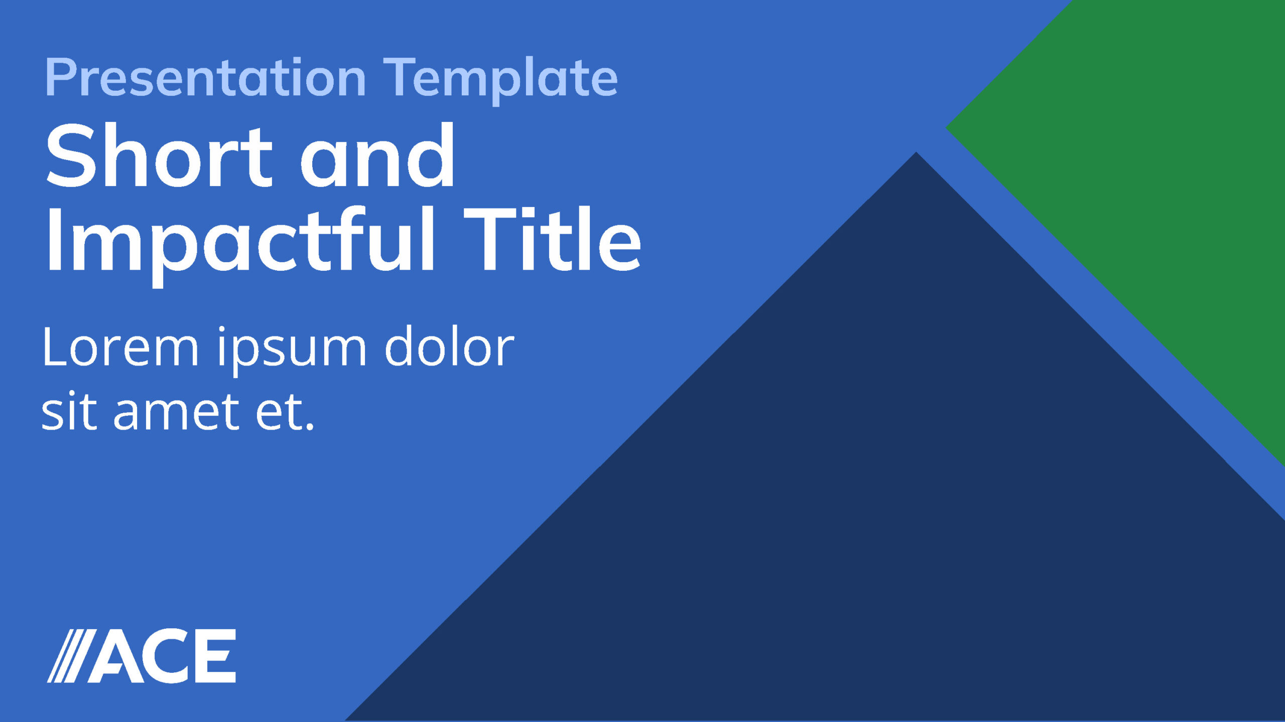
I started by optimizing their style sheet to clarify how brand colors should be used across digital and print, and identified system font alternatives to ensure brand fidelity no matter what platform their team was using. From there, I expanded their brand one-sheet into a more comprehensive guide with clear direction on color use and typography. I built out editable templates in both PDF and Canva, making sure they could be used by a wide range of stakeholders with varying design experience.
To enhance visual consistency and impact, I curated a library of on-brand stock photography and conducted research to find compelling, diverse images for their presentations and social posts. I developed a flexible suite of slide layouts and post templates so the team could move quickly while staying visually aligned.
🛼 Creative Challenges
The biggest challenge was building a system that worked for a variety of content types, from dense academic data to bite-sized social messaging, while still feeling unified. Since IACE needed to produce materials quickly and autonomously, I had to balance clear brand guardrails with creative flexibility. Accessibility was also top of mind, with a strong emphasis on legibility, color contrast, and layout clarity across all formats.
⚡️ Visual Design & Brand Identity
The design system is clean, modern, and intentionally minimal, reflecting IACE’s credibility while staying approachable. I refined layout structures, broadened type usage, and implemented visual hierarchy standards to make content feel organized and impactful. Every visual decision, down to font substitutions and photography selection, was made to support scalability. With everything uploaded into Canva, the IACE team now has a streamlined system ready to evolve with them.


- Role Creative Strategist
- Date January 2024

