
Bringing Design Solutions to Life: Partnering with CDK Global’s Marketing Strategies and Business Goals
CDK Global Inc. is an American multinational corporation based in Hoffman Estates, Illinois, providing data and technology to the automotive, heavy truck, recreation, and heavy equipment industries. With approximately $2 billion in revenues, CDK Global is a leading global provider of integrated information technology solutions to the automotive retail and adjacent industries. Focused on enabling end-to-end automotive commerce, they provide solutions to dealers in more than 100 countries around the world, serving approximately 30,000 retail locations and most automotive manufacturers. Their solutions automate and integrate all parts of the dealership and buying process, including the acquisition, sale, financing, insuring, parts supply, repair, and maintenance of vehicles.
📌 Brief
Design a new app product landing page and promotional e-mail for CDK Communicator, an application where users can manage their contact list, check on availability, and interface with their co-workers by chat, phone, or video calls. Users can dial and manage calls from their personal smartphones, desktop, and tablet just as they would from their office desk phone, including tracking calls, retrieving business voicemail, managing personal settings, and more. The landing page would also link to a direct download of the app and externally to the CDK Support page which would need to be redesigned and refreshed to address a high bounce rate.
🤌🏽 User Persona
Based on CDK’s Audience profiles and my conversations with the product owner and copywriter I put together a persona profile to ensure I maintained a focus on the very specific needs of these dealers.

✨ Collecting Inspiration
I drew my inspiration from a variety of CDK sources. I gathered screenshots of landing pages from not only CDK Global’s archive but also other websites in the industry with interesting designs and layouts.
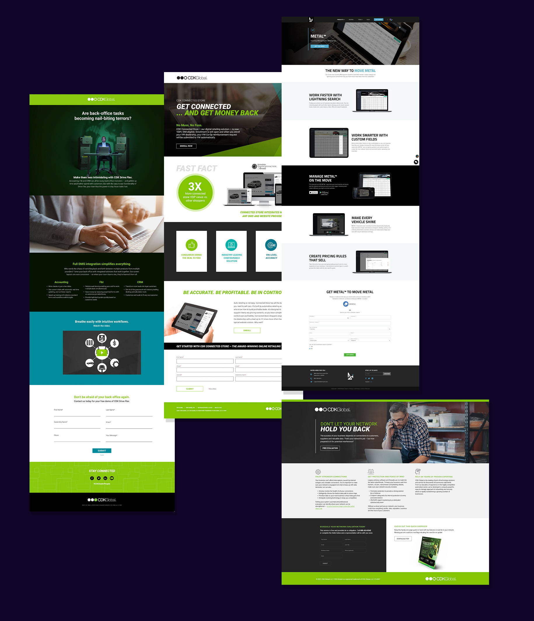
1. CDK Communicator Migration Campaign
🔍 My Research
After having some clarity with the problem statement in hand, I talked to the Product Owner and the Sr. Integrated Marketing Communications Manager after our initial kick off to collect their perspectives that I should consider for better conversions. After talking with them, the main questions that need to be answered are:
- Should screenshots be shown?
- Why should a CDK client migrate to the new system?
- What are the benefits of migrating?
- What are the steps and where is the app downloaded from?
- What is the deadline to migrate to CDK Communicator?
🤯 Making the Case for No Screenshots
I was shown some of the screenshots belonging to the CDK Communicator app. The screenshots weren’t too dynamic visually. After looking at them I decided to hop on a call with the product owner and copywriter.
- A general problem with screenshots is that they are taken without thinking much of the purpose, you have to show off most attractive things and hide anything unrelated, so make sure a screenshot doesn’t have: surrounding window frame, too much empty real estate (make the window smaller), static elements that don’t make difference.
- You should make sure your screenshots are filled with goodies, distilled and compact, straight to the point, have outstanding features that only your app provides, don’t look boring
- Screenshots are a poor way to display a mobile-resolution interface, because when small they are difficult to evaluate, and when large they confuse the user into clicking on them.
I think screenshots have a time and place and should really involve user testing. Unfortunately doing A/B testing wasn’t an option for this request. Once I showed them the screenshots in mock ups both the copywriter and product owner agreed they didn’t add anything extra to the call to action. Once I got the ok, I ran it by CDK’s Creative Director who agreed. I did however suggest that we could use a generic screenshot for the Customer Support landing page. More on that further down.

🕸 Information Architecture
I wanted the campaign landing page to concisely accomplish a simple purpose, quickly download the app and send the user to supportive links. Working with the copywriter we created a simple breakdown of the most important information:
- A bold problem solving headline with a strong CTA
- A description of the benefits
- Most dealers (as most people would be) will be hesitant to make the switch regardless of mandatory switch date so the campaign needs to focus on how easy the process will be
- The migration has a deadline and an older product will no longer work
⚡ Visual Design for CDK Communicator Migration Campaign
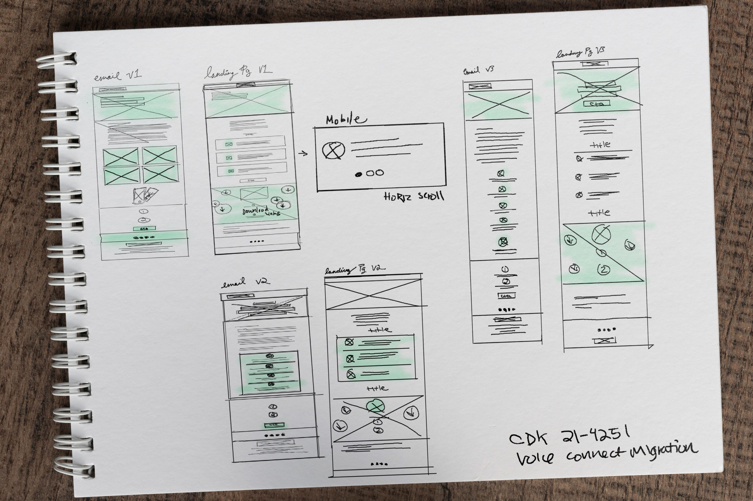
This part of the process was the most non-linear i.e. I went back and forth between wireframing, visual design, and prototyping. I started with basic wireframing on paper before jumping to visuals. After creating some lo-fi wireframes on pen and paper, I jumped straight to visual design. The prototyping was relatively simple and consisted of show some very slight floating parallaxing.
2. CDK Support Page
🔍 My Research
After having some clarity with the problem statement in hand, I talked to the Sr. Integrated Marketing Communications Manager and the Lead Developer to discuss bounce rates, overall goals for the support page and specific CDK template restrictions and usages. Below are some of the requests and pain points:
- Humanize the experience with more authentic stock photography
- Use thoughtful design to direct customers to the appropriate channel
- Help to create a sense of urgency since the user is troubleshooting
- Nod to CDK’s goals and aspirations but emphasize what CDK can do for them and how CDK can improve their life
- Address the %70-%80 bounce rate
- Due to time constraints developers will be working with templates that have specific functionalities with how the rows and columns function
- Solve for a lack of informational hierarchy and deliver the most important info above the fold
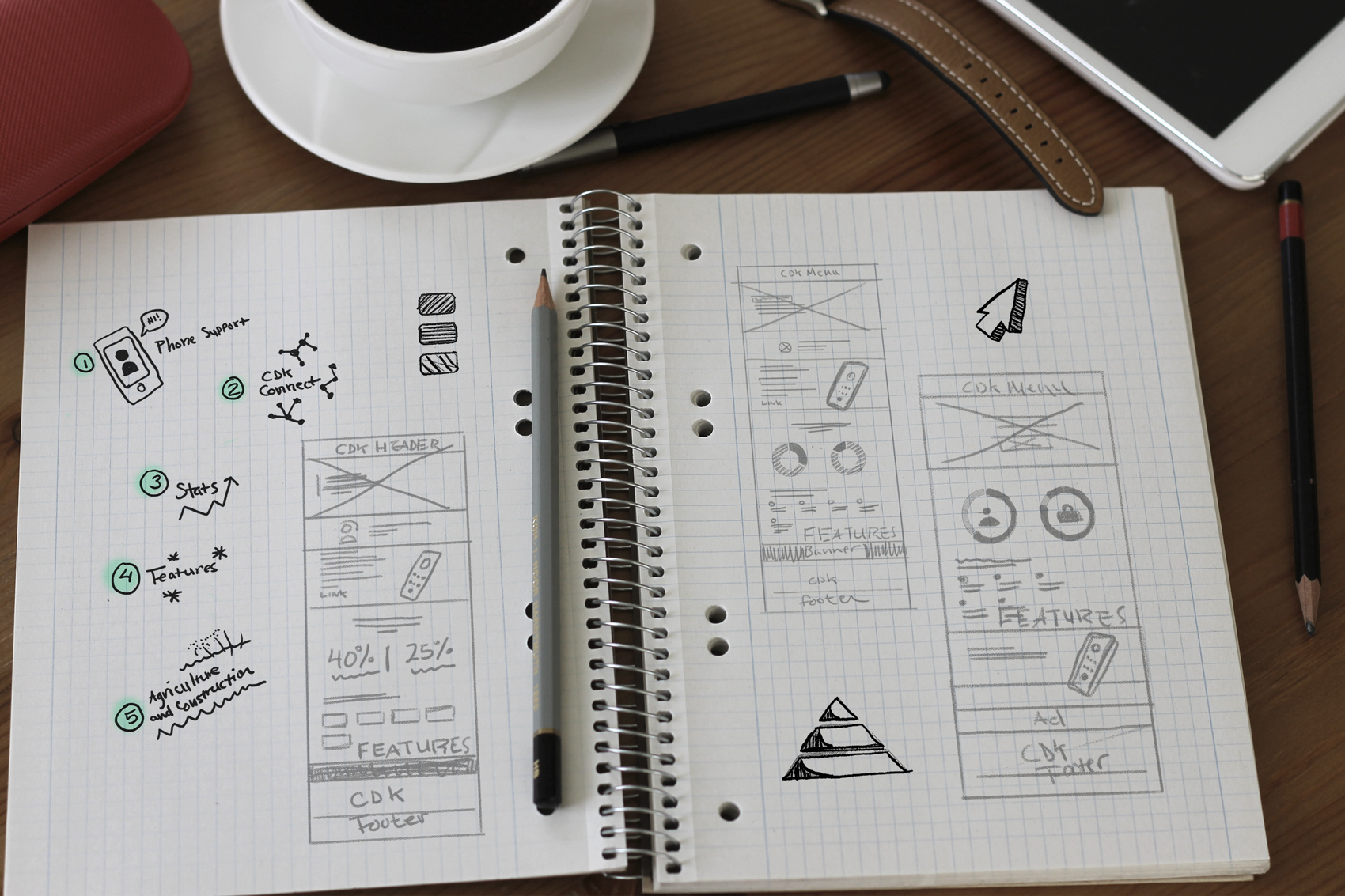
✏️ Lo-Fi Sketches & Wireframes
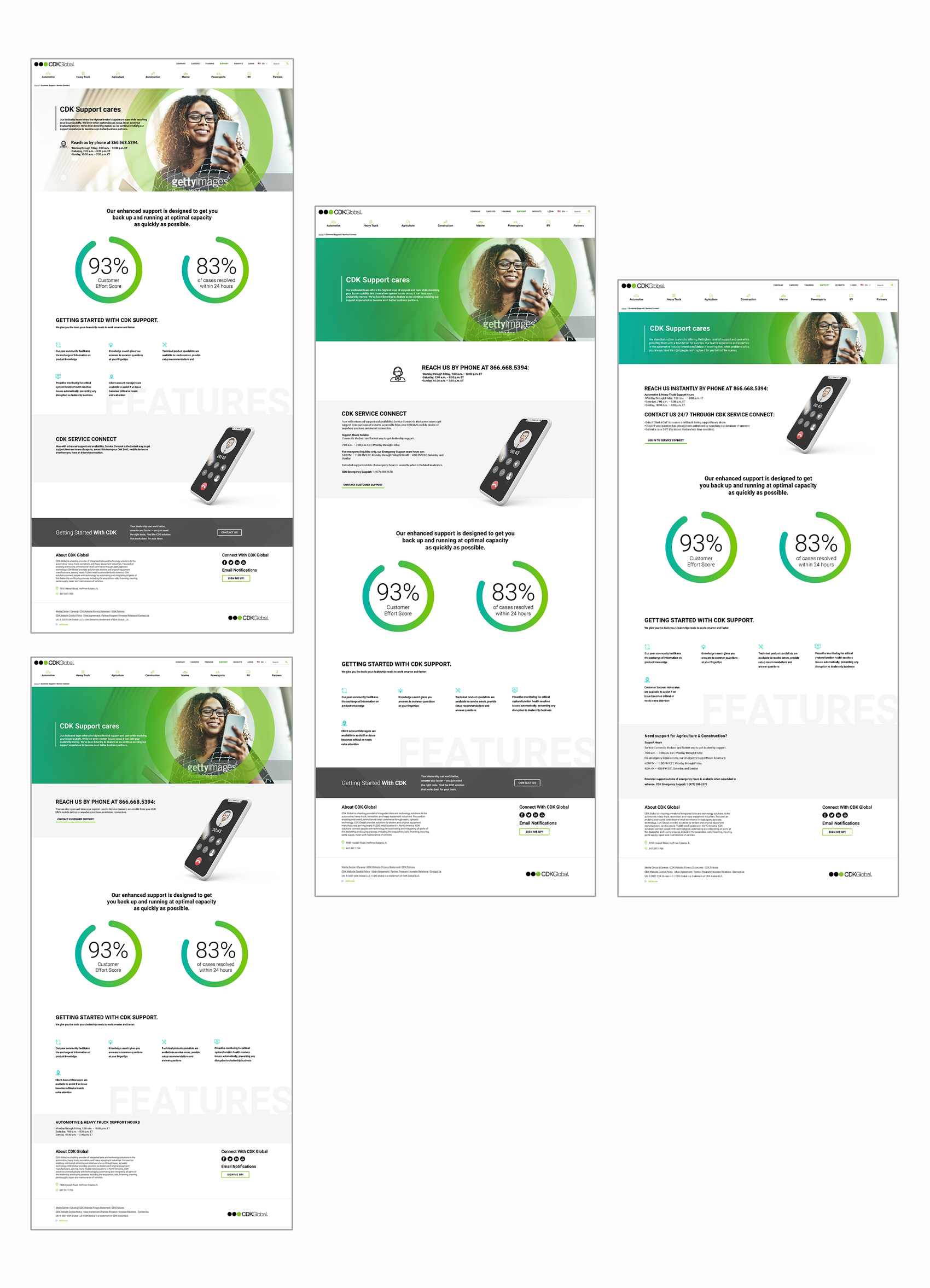
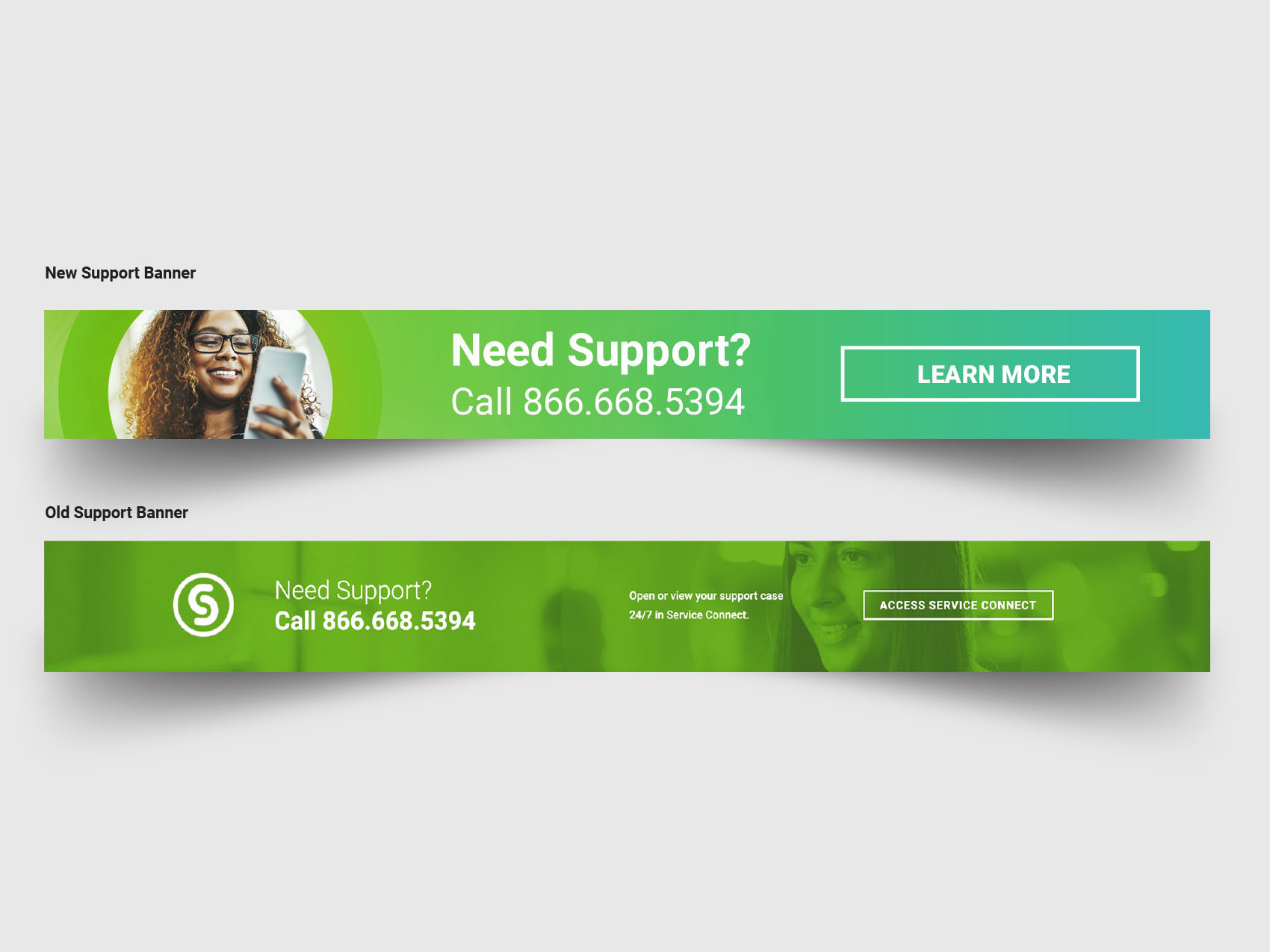
I recommended the service page update their hero image, but insisted that they still use a person to humanize the page. I wanted the hero image to tell a story, someone using their phone to connect to support. Since CDK Global was phasing out CDK Connect and that login/dashboard experience, it made sense to lead with the support number information and show the phone’s screen calling a real person.
I wanted the page to be easily scanned so I kept but simplified the F-Shaped pattern for the layout. This reading pattern followed three components:
-
Kept the most important information in the upper part of the content area. This initial element forms the F’s top bar (studies have shown most people scan and read from left to right and top to bottom).
-
Next, I created a visual vertical line down the left side of the screen using negative space. I made it easy for the user to quickly find points of interest across in a second horizontal movement that covered a shorter area than the previous movement. This additional element formed the F’s lower bar.
-
Finally, users scanned the content’s left side in a vertical movement:
Bearing the F-shaped pattern in mind helped create a design with good visual hierarchy — a design that people could scan easily.

⚡ Visual Design for CDK Support Page (and banner)
The F-shape pattern simply follows the common trends of the human eye which allowed me to optimize the structure of the layout. The bounce rate saw a reduction almost immediately and fell well within the excellent range between 30% to 50%. I added structure to the page by directing different requests to the appropriate teams. This allowed the removal of any obstacles between points A to B. While I don’t strictly adhere to ‘above the fold’ mentality I did lay out the page with the necessary hierarchy in mind while also allowing for a natural scroll to happen. I retained the visitors’ interest on the page through intuitive web design along with attention-grabbing content.
- Role Sr. Creative Designer
- Date June 2021