Nourishing Chicago: A Visual Identity Rooted in Community
✨ The Impact ✨
- Operational Efficiency: This system was designed to empower non-designers, using stock-photo-friendly layouts to maintain high quality on lean budgets.
- Civic Positioning: The concept utilized the Chicago star to frame Windy City Harvest as vital urban infrastructure. This direction aimed to build the civic pride necessary to secure city partnerships and funder credibility.
- Scalable Growth: The visual system was built to signal organizational maturity, creating a recognizable brand across neighborhoods to attract major donors and support citywide expansion.
📌 Brief
Create a full brand identity and visual ecosystem for Windy City Harvest, an initiative focused on building sustainable food systems across Chicago through community gardens, education, and mentorship. The branding needed to feel trustworthy, joyful, and deeply rooted in the community, while still professional enough to attract partners, donors, and volunteers. Deliverables included a logo system, color palette, print materials, social templates, signage, and website layouts.
🤌🏽 Target Audience
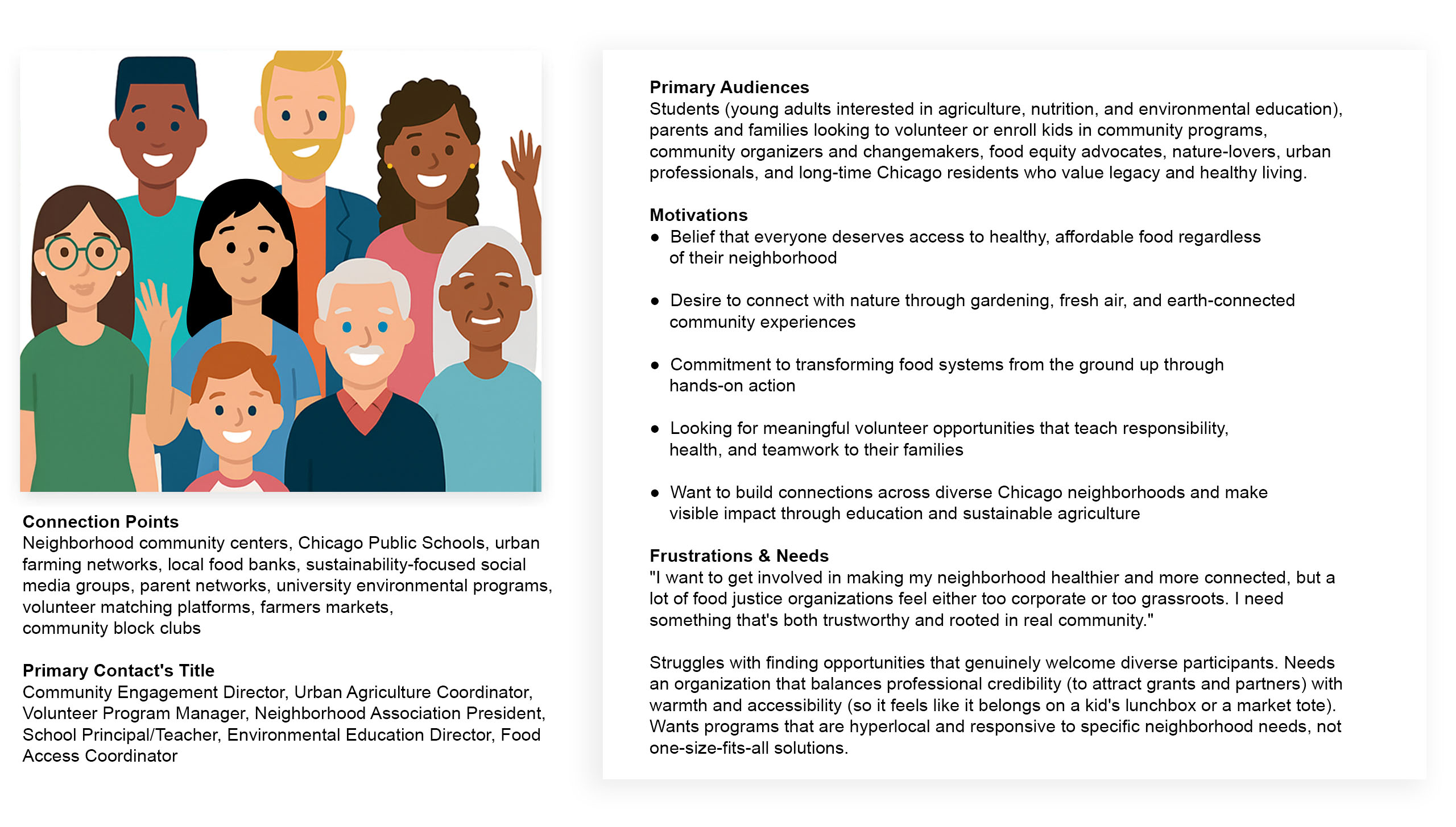
To engage Windy City Harvest’s diverse audience, the brand had to appeal to both hyperlocal community members and institutional partners. That meant designing for families in underserved neighborhoods, curious volunteers, urban farming advocates, and donors looking to make a visible impact. Visually, the brand had to strike a balance: grounded and trustworthy for city partnerships and grants, but warm and vibrant enough to feel like it belongs on a kid’s lunchbox or a market tote.
👨🏽🎤 Creative Process
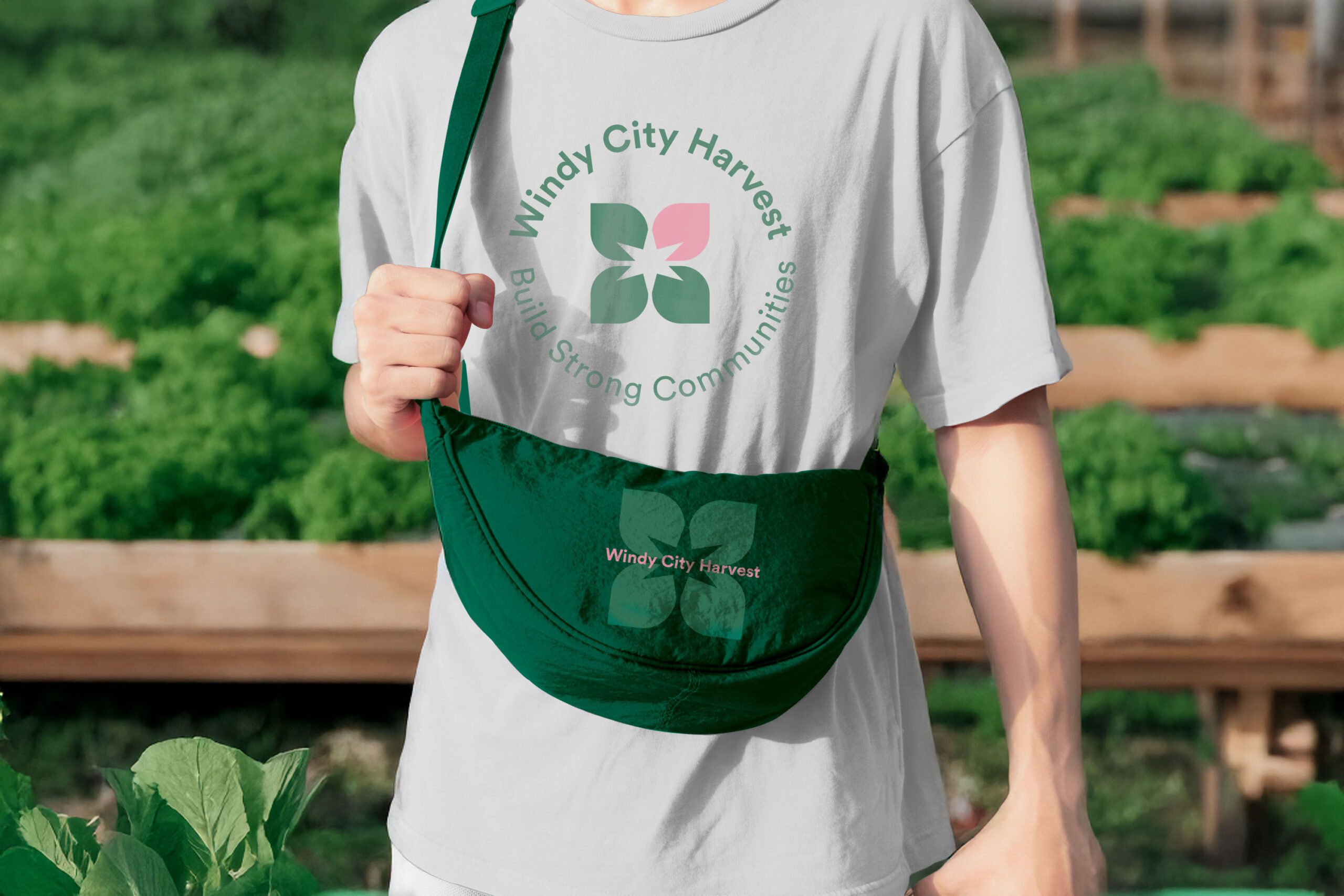
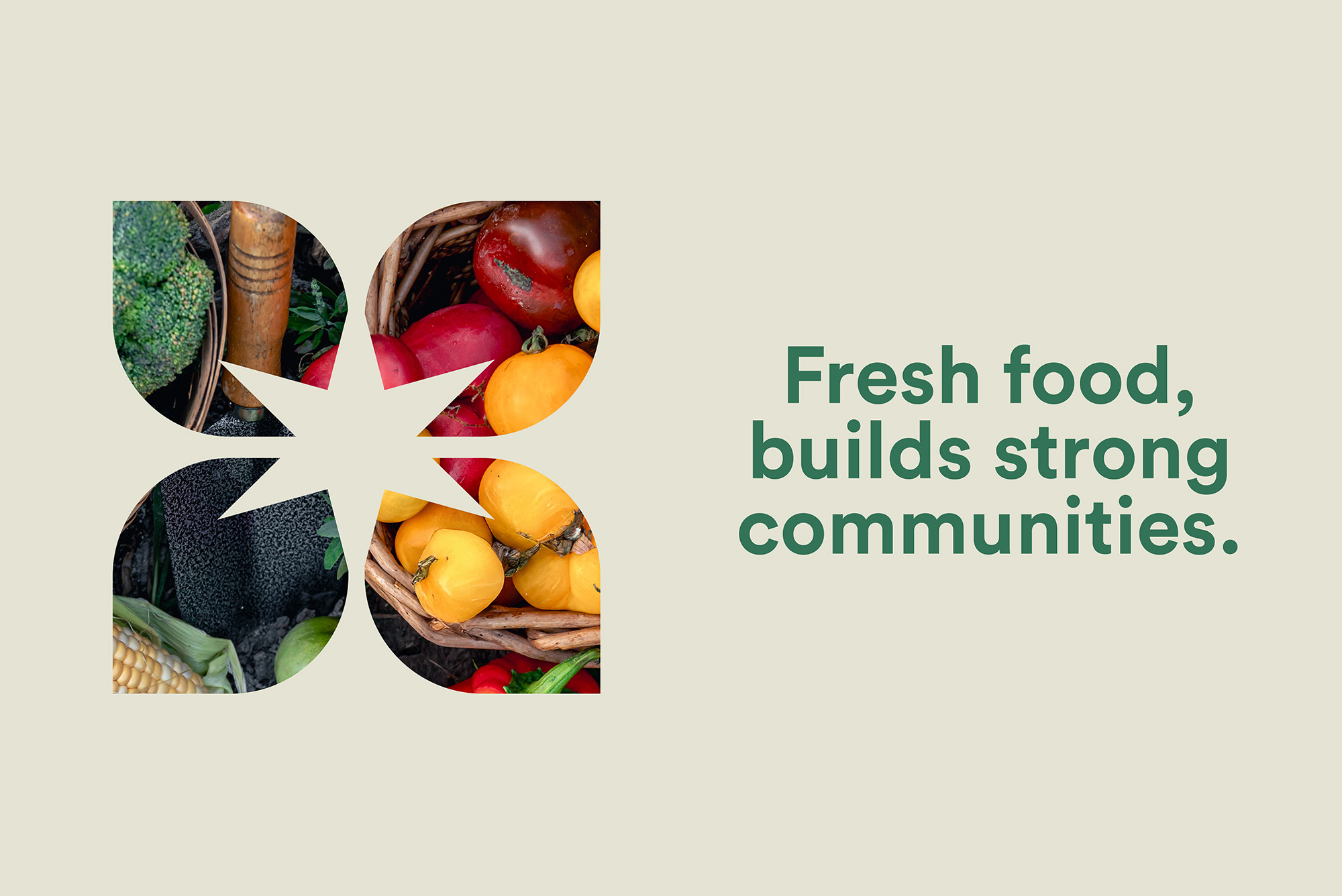
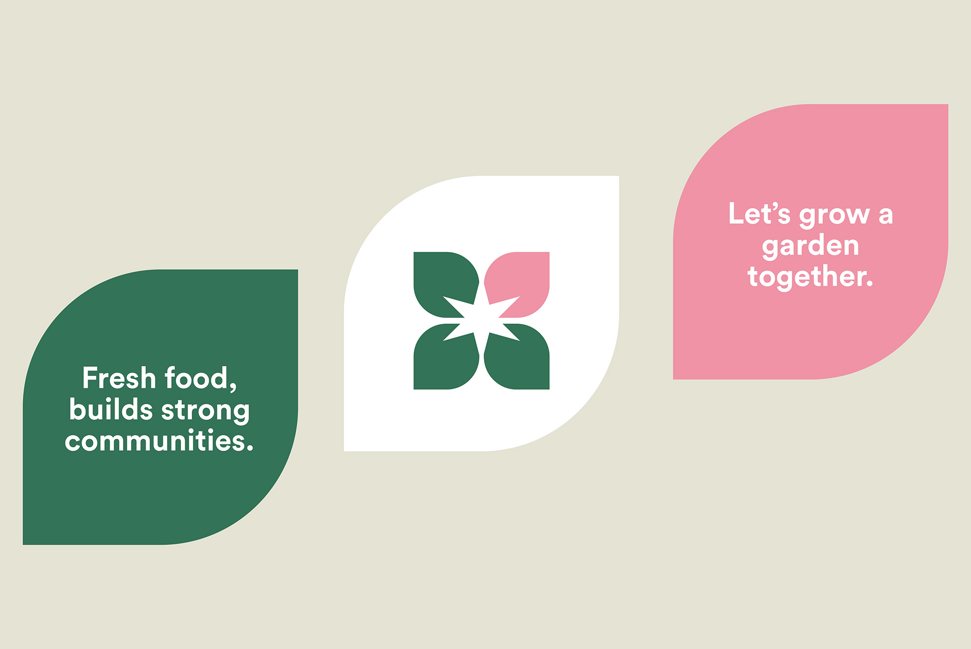
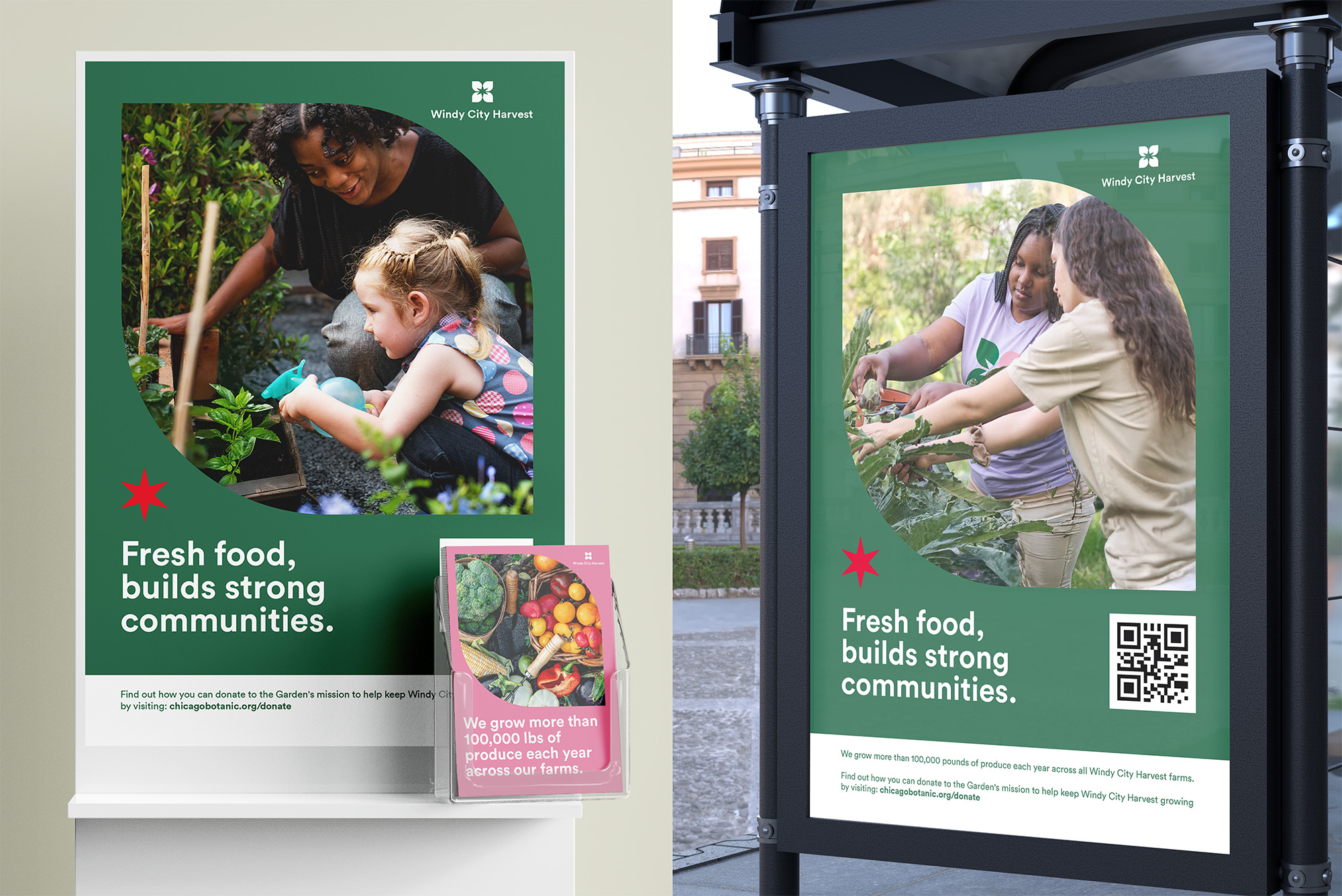
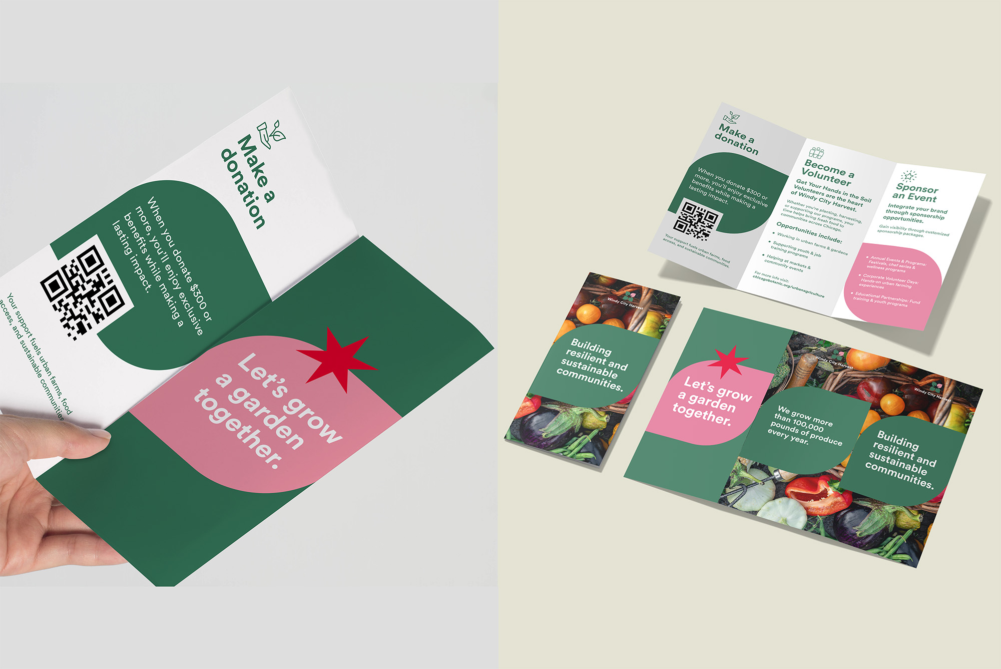
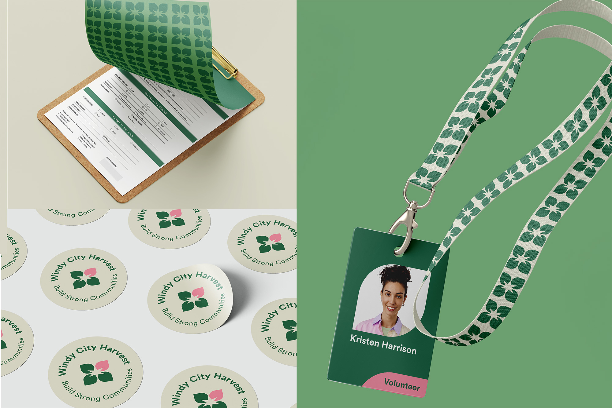
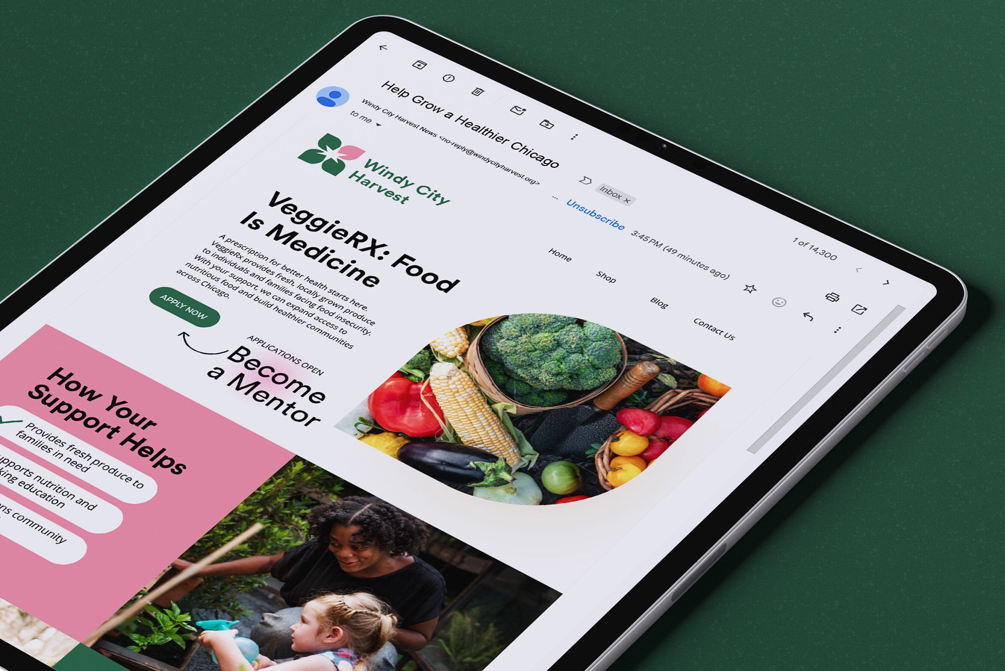
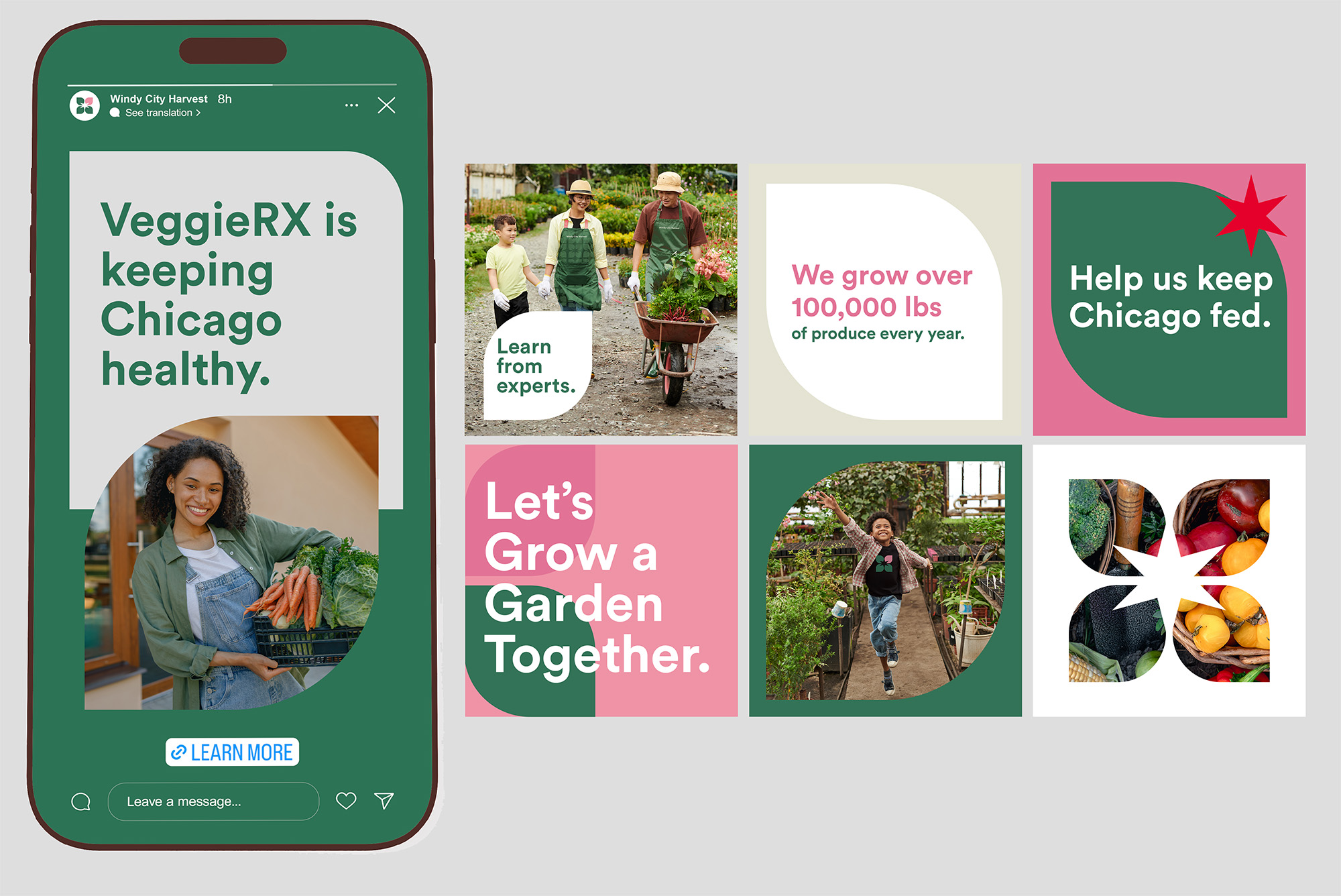
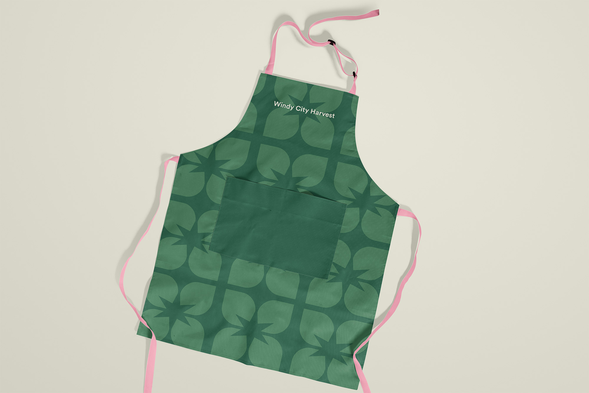
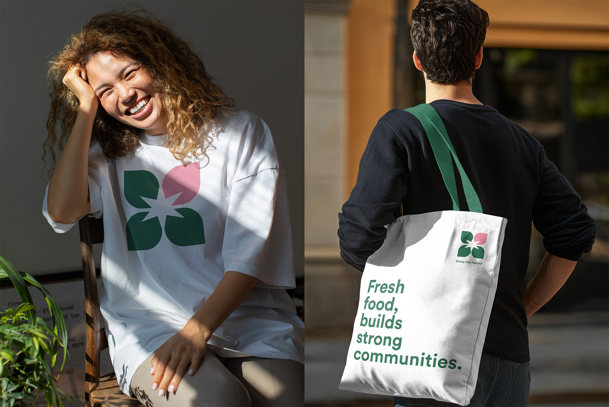
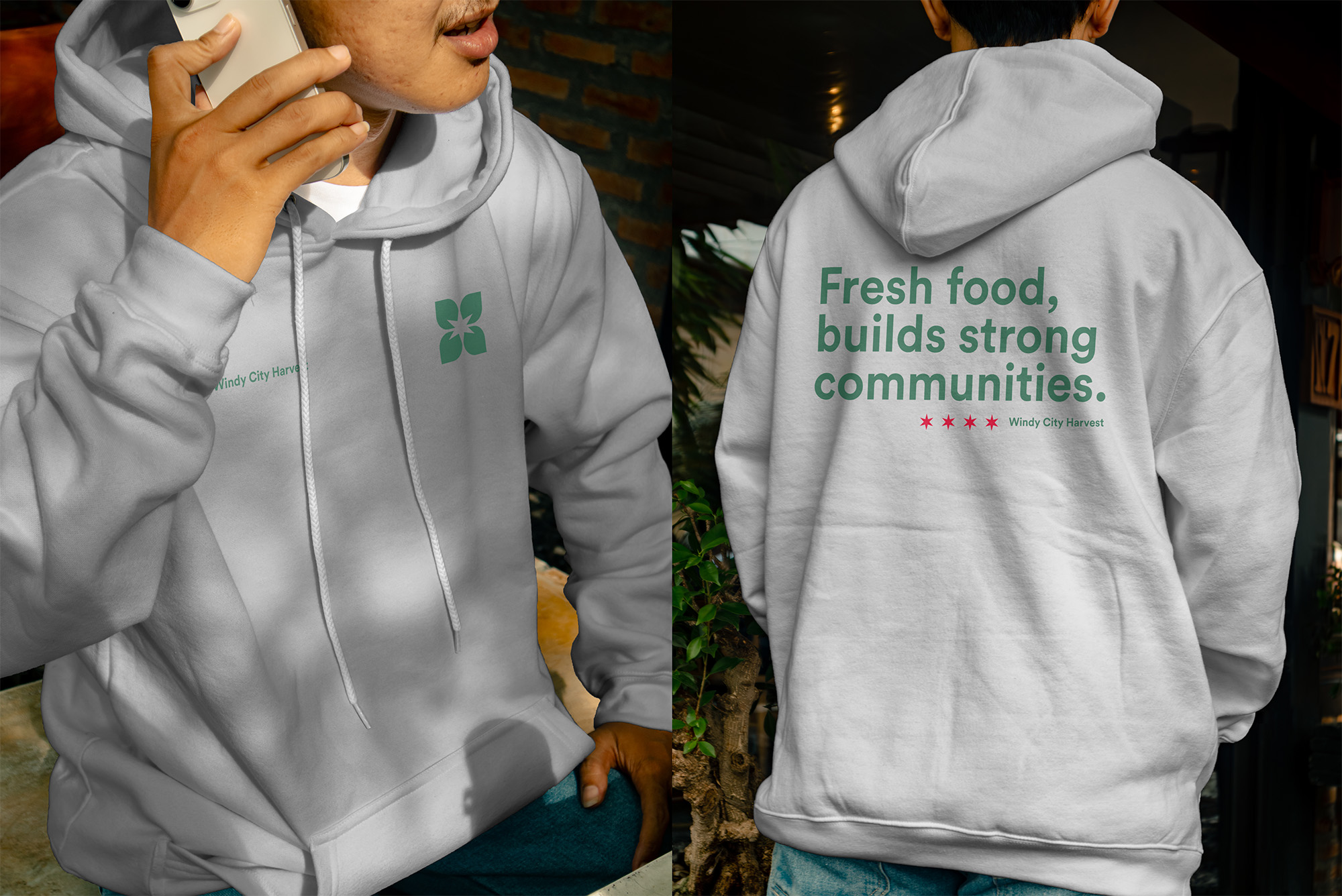
Built a brand identity rooted in growth and Chicago pride. The four-leaf logo (with pink accent) has a conceptual layer: the negative space forms the six-pointed Chicago star from the city flag. We extracted that star as a standalone graphic element for OOH and marketing campaigns, reinforcing civic identity. The modular shape system and green-pink palette work everywhere – from bus shelters to volunteer lanyards.
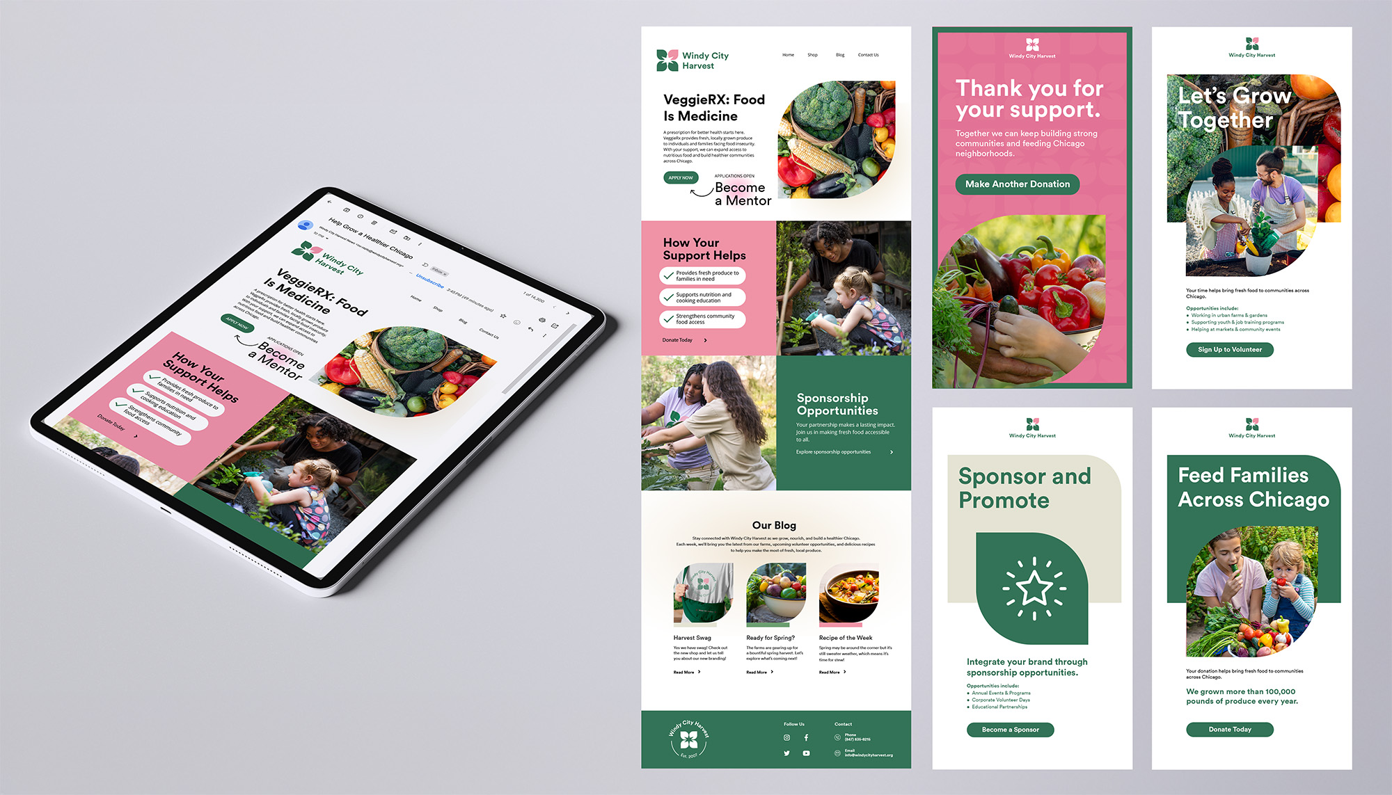
Designed for internal staff to use easily, the system includes plug-and-play templates, stock photo-friendly layouts, and modular assets maintaining brand integrity without design expertise. Messaging focuses on impact; the comma creates a deliberate pause which gives the line weight and an almost spoken cadence. “Fresh food, builds strong communities,” “Help us keep Chicago fed.” The system spans recruitment flyers, donor materials, OOH ads, email, social media, website, signage, and merch.
The tone of voice was kept inviting and neighborly, emphasizing action and togetherness without slipping into nonprofit cliché.
🛼 Creative Challenges
The biggest challenge? Making the identity feel both grassroots and credible. It had to speak to local families and city stakeholders in the same breath. That meant stripping away anything overly trendy and focusing on timeless, accessible design. The campaign also required building a cohesive brand experience across dozens of mediums, from donation forms to community signage; each needed to be instantly recognizable, legible, and flexible enough for future initiatives.
⚡️ Visual Design
The design system is anchored in organic shapes, intentional whitespace, and messaging that puts community first. Collateral like flyers and brochures use curved color blocks and high-impact photography to tell human stories. Every piece was designed to feel fresh from the garden: simple, vibrant, and intentional. The result is a unified brand that feels equally at home at a farmer’s market, on a city billboard, or in the hands of a volunteer.
🔸 The Outcome
While the Chicago Botanic Garden ultimately decided to maintain a unified brand architecture under their primary identity, this project remains a masterclass in building a scalable, civic-minded sub-brand. It was designed to transition the organization from “fringe” to “essential,” signaling maturity to major donors while remaining accessible at neighborhood farmers markets.
- Role Brand Identity Designer
- Date March 2025