Architecture with Feeling
✨ The Impact ✨
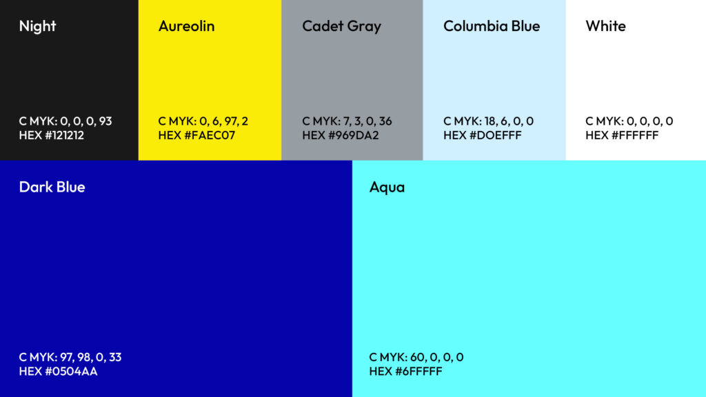
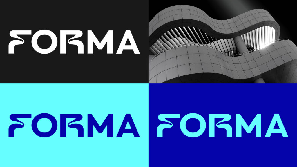
Market Positioning: Rebrand gave Forma credibility and visual presence competing with larger, established firms. Clean, energetic identity system made them instantly recognizable in pitch meetings and industry events, positioning them as both innovative and trustworthy. Differentiated through electric blue + aqua color strategy versus industry-standard grays.
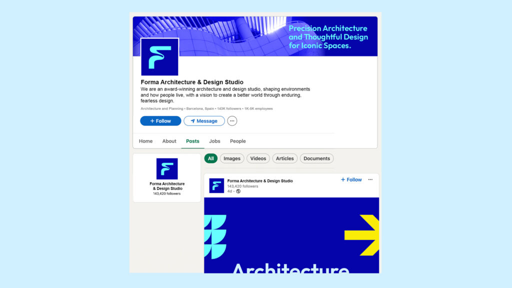
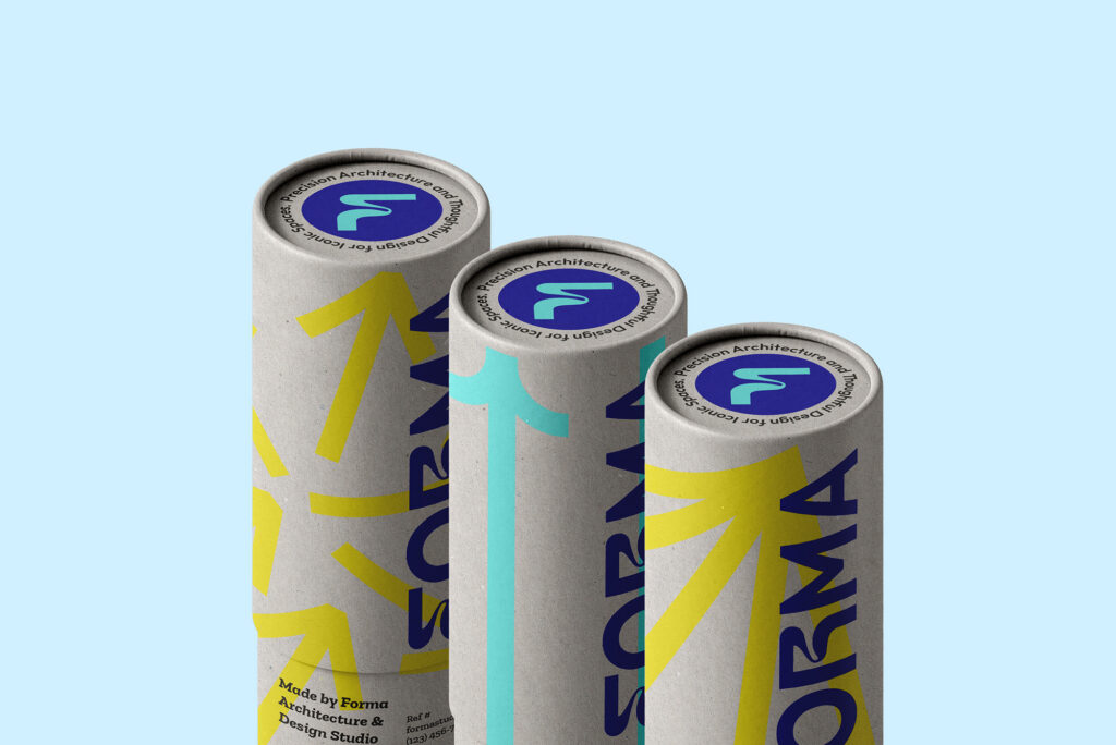
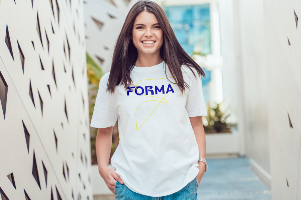
System Scalability: Flexible brand system scaled seamlessly as they grew, maintaining consistency across every touchpoint without feeling rigid or formulaic. Pattern library provided endless combinations while staying on-brand. Went from generic architecture firm to one looking and feeling like future of design: structured, confident, built to evolve.
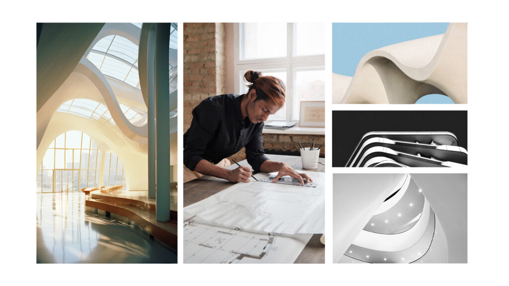
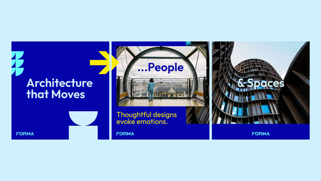
Human-Centered Architecture: Brand reflects Forma’s philosophy that architecture isn’t just building structures – it’s shaping form with purpose, creating iconic spaces where people live and work. Visual language captures both technical precision and human warmth, differentiating in industry often focused only on structures rather than experience.
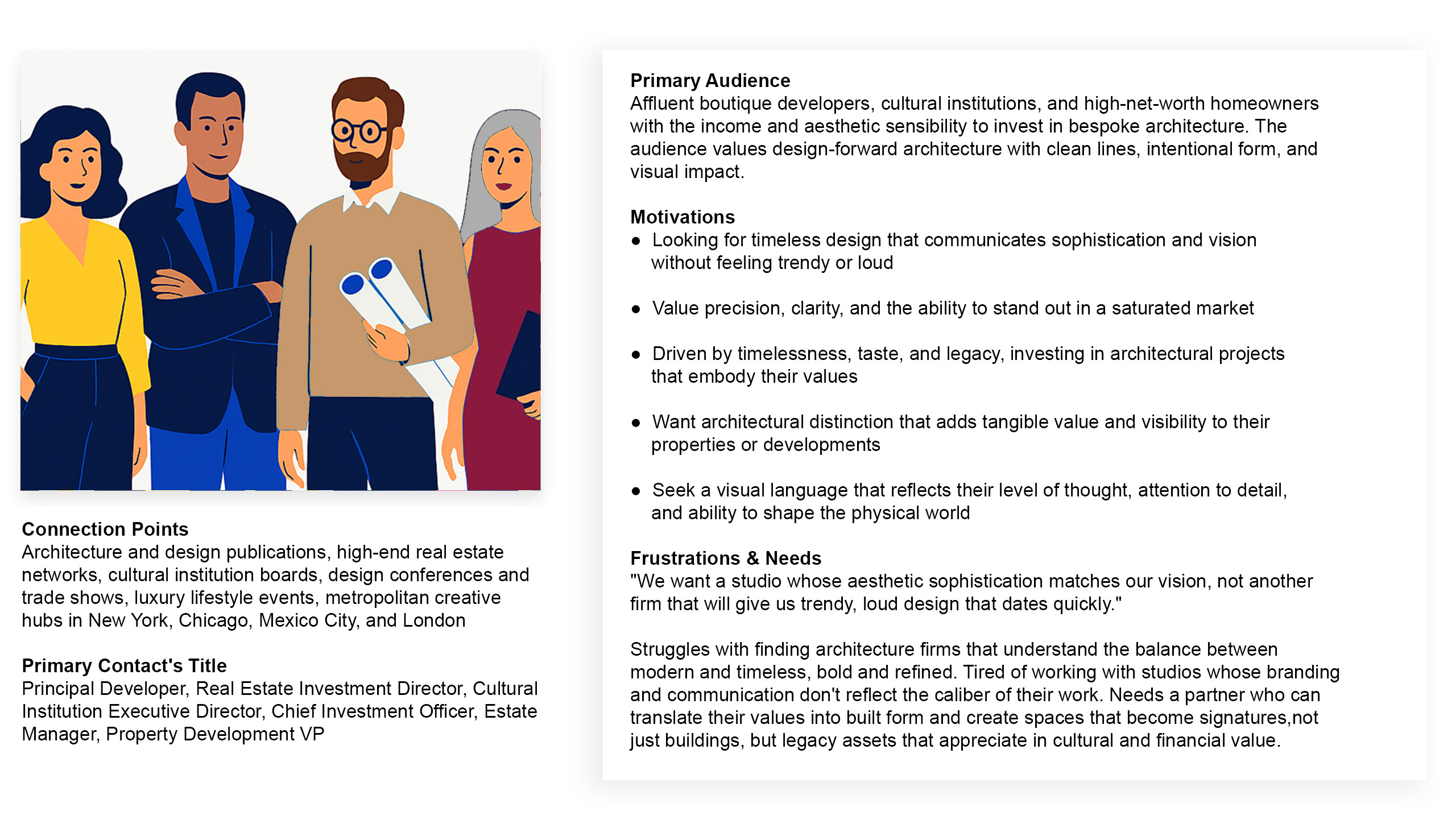
🤌🏽 Target Audience
Forma’s identity needed to speak to visionary real estate developers, design-forward construction firms, and ambitious architects who see space as more than shelter. These clients value elegance, clarity, and timeless structure. They want to feel modern without being trendy, elevated without being cold. The goal was to give them a visual language that reflects their level of thought, attention to detail, and ability to shape the physical world.
📌 Brief
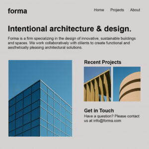
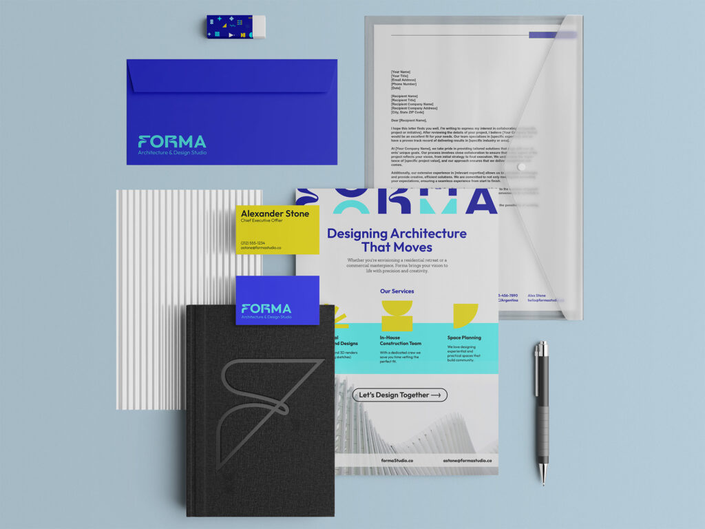
Forma needed a full brand identity from scratch: logo, color palette, typography, brand system, and social rollout. Their work speaks volumes, but their branding didn’t. They needed an identity that would reflect their sharp thinking, future-facing philosophy, and ability to attract high-end clients.
👨🏽🎤 Creative Process
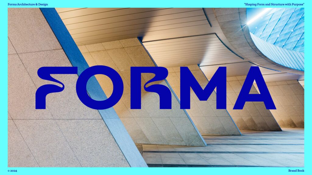
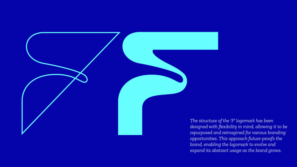
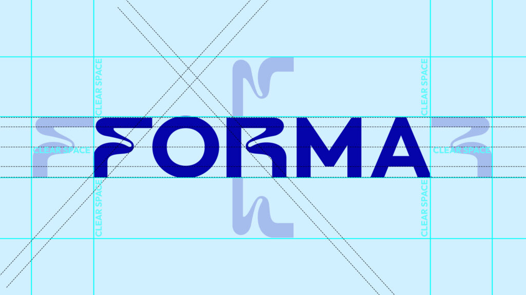
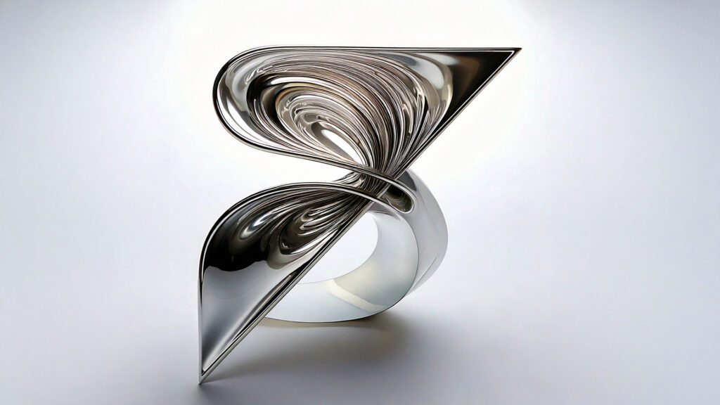
I started with the name: Forma. Meaning “form” in Latin, it hinted at something structural but human. That became the guiding principle. From there, I explored the interplay between negative space and bold structure, letting the design mirror architecture itself. The “F” logomark was built to flex and evolve, while still maintaining its core geometry. The logo and typography both play with curve and edge, mirroring Forma’s architectural approach: balanced, smart, and expressive.
🛼 Creative Challenges
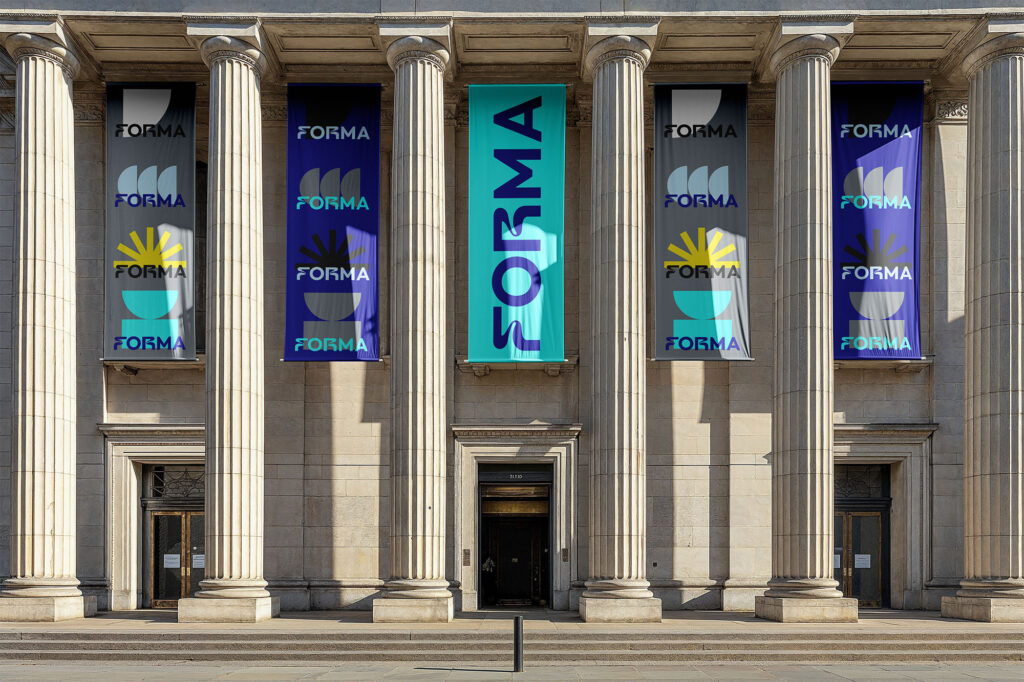
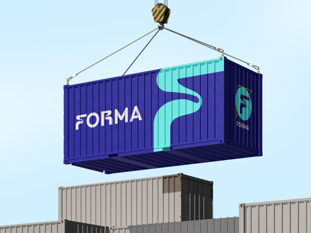
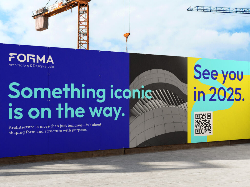
Forma didn’t want to feel like just another firm. They wanted a presence that would make developers stop scrolling, pause during a pitch deck, and remember them after a walk-through. The brand had to be able to live on everything from blueprints to billboards to digital pitches. We had to build a system that was scalable, legible, and iconic.
⚡️ Visual Design
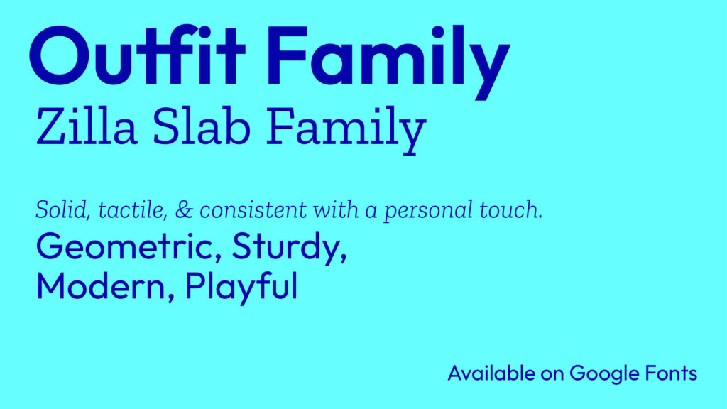
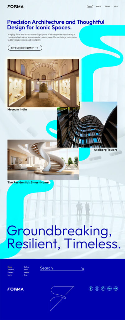
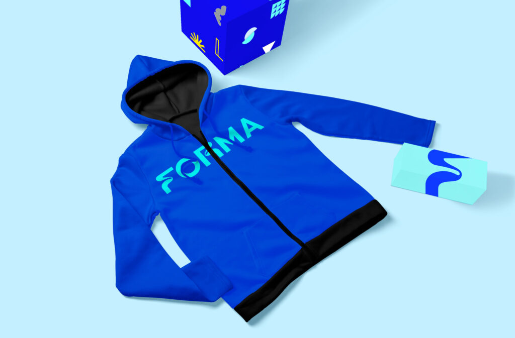
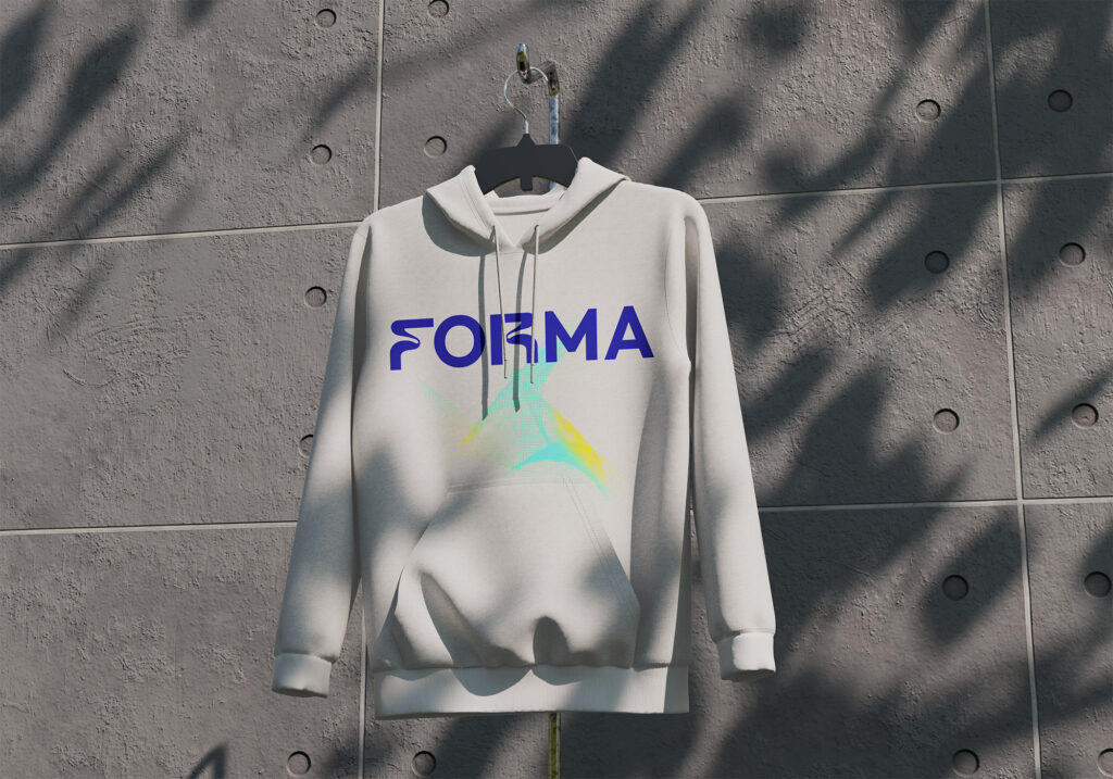
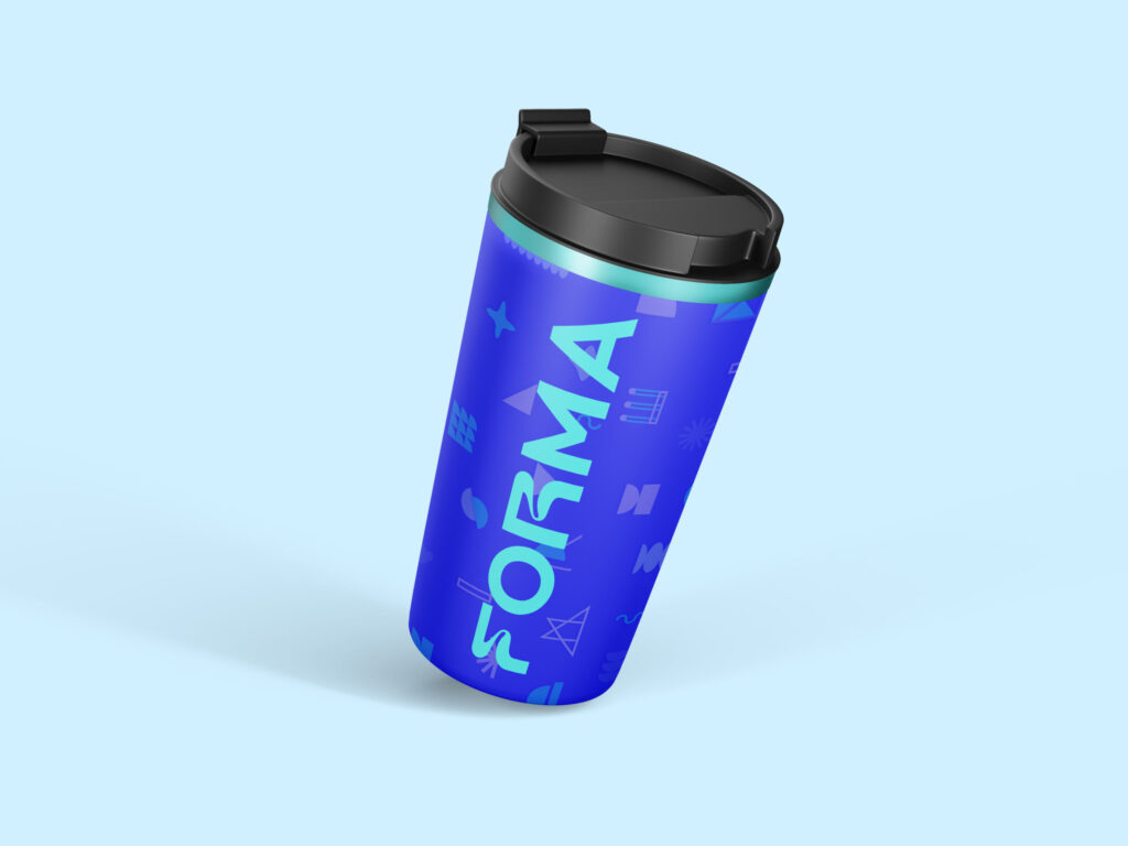
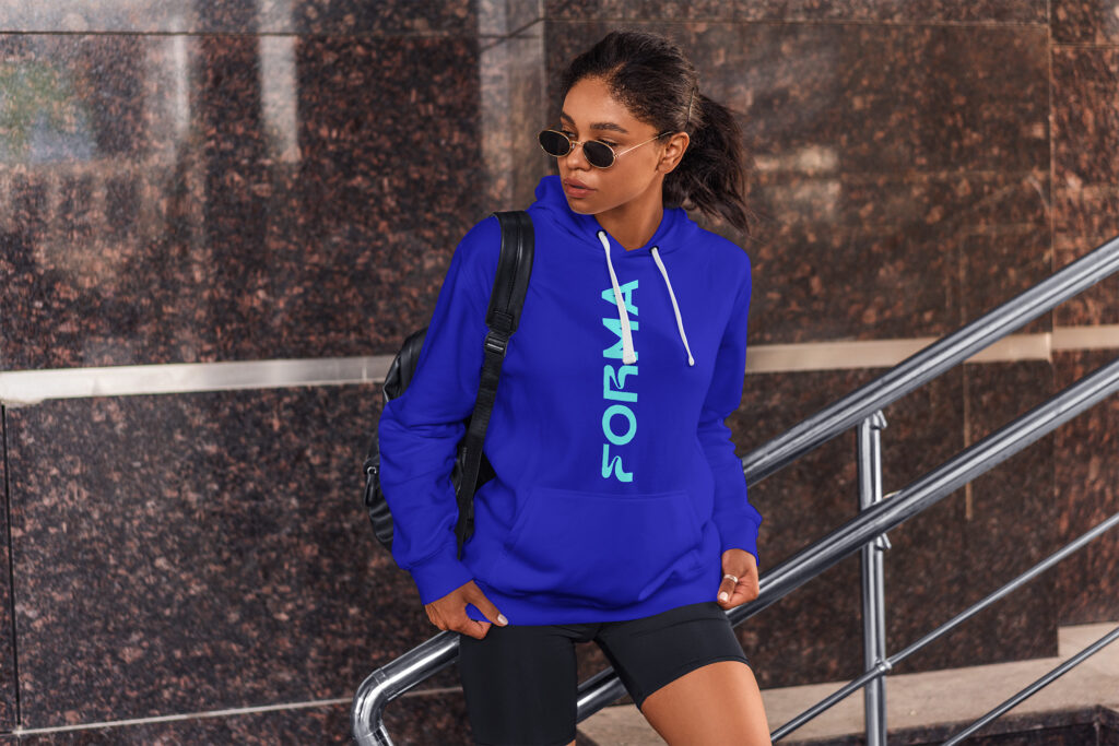
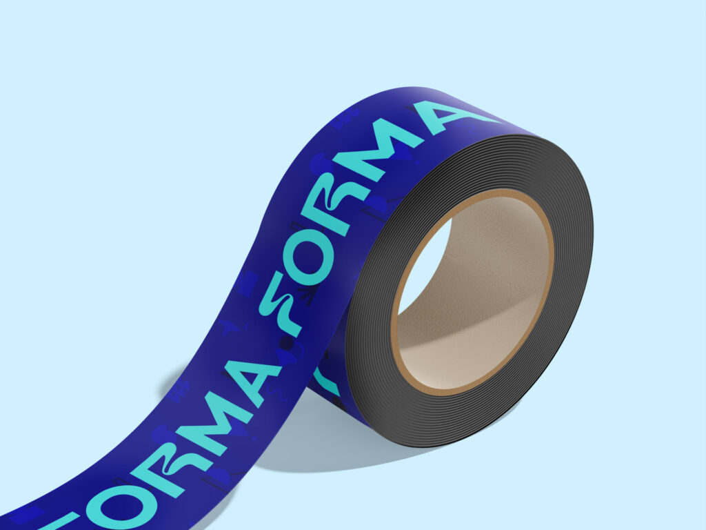
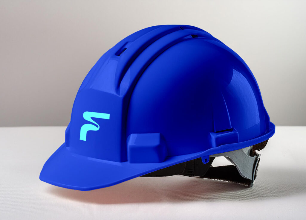
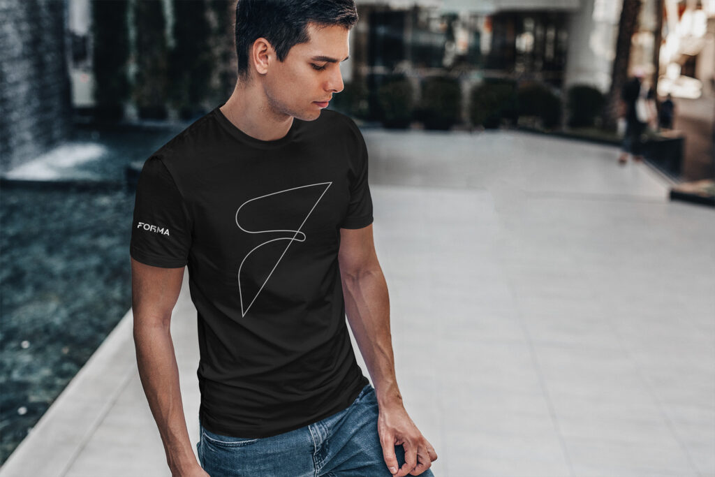
The color palette is minimal with electric hits of aqua and aureolin, a deliberate move to spark attention in a sea of grayscale architecture brands. The grid system allows for creative layouts while keeping everything clean. Typography is customized to echo the logo’s balance of strength and movement. The result is a brand that feels architectural in itself: flexible, bold, and confident in its own form.
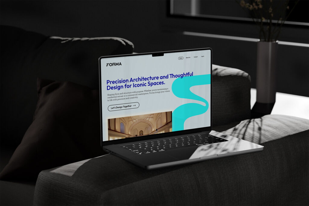
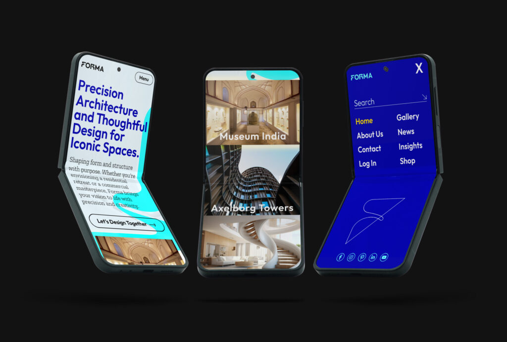
Forma also brought me in to design the flagship homepage for their evolving brand identity. A high-impact entry point optimized for brand storytelling and visual distinction. While the full site is still in development, this homepage establishes the creative tone and structure for future pages, including gallery, contact, and shop. It introduces Forma with clarity and confidence, guiding new visitors into the world of thoughtful, precision-driven architecture.

- Role Creative Brand Director
- Date February 2024